Visual Inference with R
How can we use data visualization for hypothesis testing? This question lies at the heart of this Methods Bites Tutorial by Cosima Meyer, which is based on Richard Traunmüller’s workshop in the MZES Social Science Data Lab in Fall 2017. We already covered the basic idea of visual inference in our blog post on Data visualization with R.
Note: This blog post presents Richard’s workshop materials in condensed form. The complete workshop materials are available from our GitHub.
Overview
What is visual inference?
Visual inference uses our ability to detect graphical anomalies. The idea of formal testing remains the same in visual inference – with one exception: The test statistic is now a graphical display which is compared to a “reference distribution” of plots showing the null. Put differently, we plot both the “true pattern of the data” and additional random plots of our data. By comparing both, we should be able to identify the true data – if the pattern is not based on randomness. This approach can be applied to various (research) situations – some of them are described in the “Practical applications” section.
Potential challenges and how to overcome them
Major concerns related to exploratory data analysis are its seemingly informal approach to data analysis and the potential over-interpretation of patterns. Richard provides a line-up protocol how to best overcome these concerns:
1. Identify the question the plot is trying to answer or the pattern it is intended to show. 2. Formulate a null hypothesis (usually this will be \(H_0\): “There is no pattern in the plot.”) 3. Generate and visualize a null datasets (e.g., permutations of variable values, random simulations)
The following examples illustrate this procedure and explain the steps in detail.
Practical applications: How do we reveal the “true” data graphically? A step-by-step guide
To reveal the “true” data, we may use several visual approaches. In the following, we present three different examples: 1) maps, 2) scatter plots, and 3) group comparisons. The underlying logic follows the line-up protocol described above. To produce the visual inference, we always apply the following steps:
1. Identify the question: ‘Is there a visual pattern?’ 2. Formulate a null hypothesis: ‘There is no visual pattern.’ 3. Generate null datasets: Just randomly permute one variable column and plot the data. 4. Add the “true” data: Add the true data to the null datasets. 5. Visual inference: Is there a visual difference between the randomly permuted data and the “true” data?
1) Maps
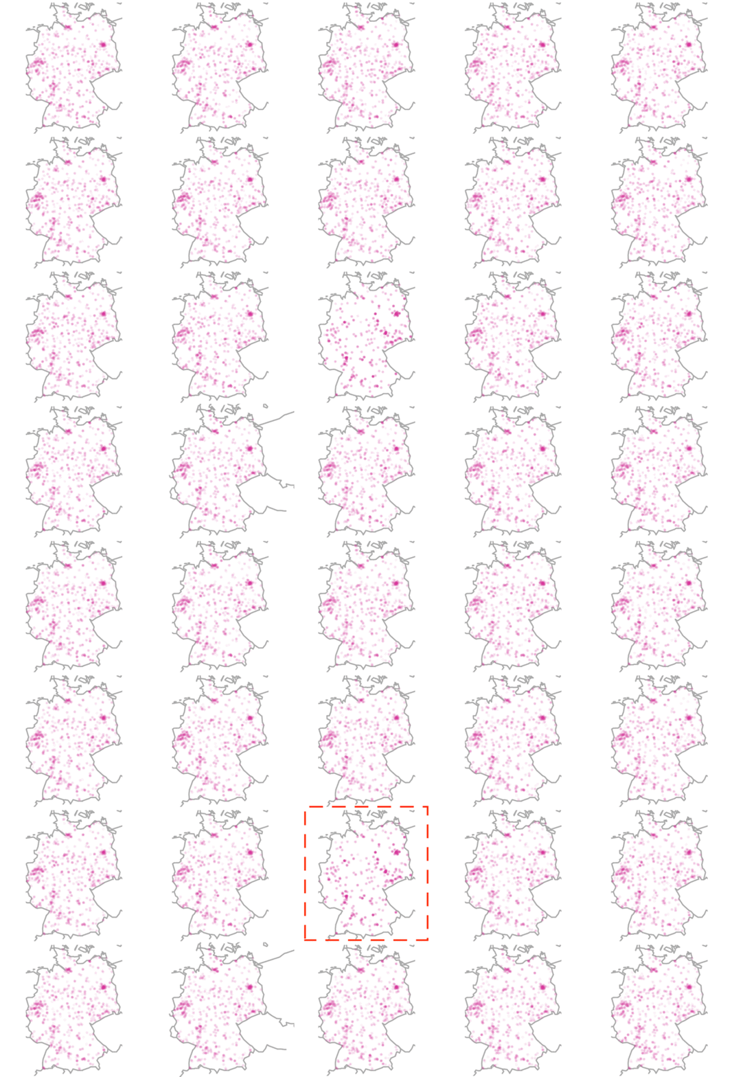
This map provides an intuitive understanding of how to apply the line-up protocol to a real-world example. Richard uses data from the GLES (German Longitdunal Election Survey) as an example to analyze the interviewer selection effects. These biases arise if interviewers selectively contact certain households and fail to reach to others. Reasons might be that researchers try to avoid less comfortable areas.
As a first step, we need to read in the required packages as well as the data and code the interviewer behavior by color.
# Read all required packages
library(maps)
library(mapdata)
library(RColorBrewer)

# Read data
data <- readRDS("sub_data.rds")

# Code interviewer behavior by color
data$col <-
  ifelse(data$status == "No Contact", "maroon3", "darkolivegreen2")
Following the line-up protocol described above, we seek to answer the question if there is a visual pattern. Our null hypothesis assumes that there is no visual pattern. To generate the null dataset, we randomly permute one variable column and plot the data.
# Generate random plot placement
placement <- sample((1:20), 20)
layout(matrix(placement, 4, 5))

# Generate 19 null plots
par(mar = c(.01, .01, .01, .01), oma = c(0, 0, 0, 0))
for(i in 1:19) {
  # Randomize the order
  random <- sample(c(1:15591), 15591)
  # Plot
  map(
    # Refer to dataset
    database = "worldHires",
    fill = F,
    col = "darkgrey",
    # Range of x-axis
    xlim = c(6, 15),
    # Range of y-axis
    ylim = c(47.3, 55)
    )
  points(
    # Refer to data
    data$g_lon,
    data$g_lat,
    cex = .1,
    # Type of plotting symbol
    pch = 19,
    col = data$col[random]
    )
}
We then proceed and add the true data to the null datasets.
# Add the true plot
map(
  database = "worldHires",
  fill = F,
  col = "darkgrey",
  # Range of x-axis
  xlim = c(6, 15),
  # Range of y-axis
  ylim = c(47.3, 55)
  )
points(
  # Refer to data
  data$g_lon,
  data$g_lat,
  cex = .1,
  # Type of plotting symbol
  pch = 19,
  col = data$col
  )

# Reveal the true plot
box(col = "red", # Draw a box in red
    lty = 2, # Defines line type
    lwd = 2) # Defines line width
    which(placement == 20) # Defines the place of the box
Using the code above, we receive twenty maps from Germany. In a last step, we ask if these plots are substantially different from one another. If yes, can you tell which one is the odd-one-out? Just wait for a few seconds to let the image reveal the answer.
2) Scatter plot
Mimicking the approach for the maps, we proceed in a similar way with scatter plots.
Assume we have two variables and want to plot their correlation with a scatter plot. To compare if their relation is random, we can make use of visual inference. To do so, we first need to load all required packages and read in the data.
# Read required package
library(foreign) # Necessary to load datasets in other formats (such as .dta)

# Read the data
slop <- read.dta("slop_2009_agg_example.dta")
We then proceed and place randomly 20 plots within a 4x5 grid cells.
# Generate a random plot placement
placement <- sample((1:20), 20)
layout(matrix(placement, 4, 5))
We want to position 19 out of 20 random plots and leave one grid cell empty for the “true” plot.
Code: Plotting nineteen random scatter plots
# Plot 19 null plots
par(mar = c(.1, .1, .1, .1))
for(i in 1:19) {
  # Plot random scatter plots of the data
  random <- sample(c(1:dim(slop)[1]), dim(slop)[1])
  plot(slop$mkath[random],
  slop$cdu,
  axes = F,
  ann = F,
  cex = .4)
  # Plot a box with grey lines
  box(bty = "l",
  col = "grey")
}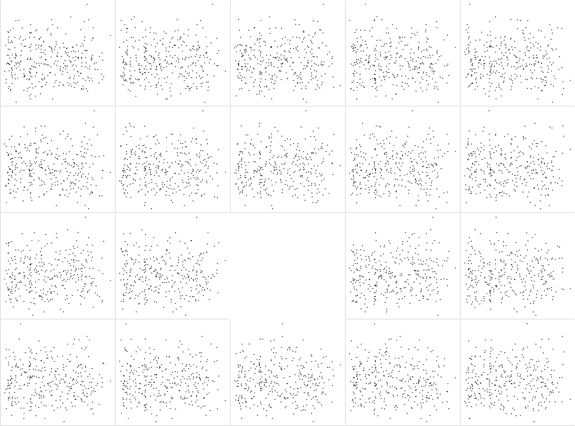
As we can see, we get a 4x5 grid cell with 19 randomly assigned scatter plots and one empty cell. We now proceed and fill this empty cell with the “true” data and plot a box around it.
Code: Adding and revealing the true data
# Add true plot
plot(slop$mkath,
     slop$cdu,
     axes = F,
     ann = F,
     cex = .4)
box(bty = "l", # Plot a box with grey lines
    col = "grey")

# Reveal true plot
box(col = "red", # Plot a box with red dashed lines
    lty = 2,
    lwd = 2)
which(placement == 20) # Define the position of the box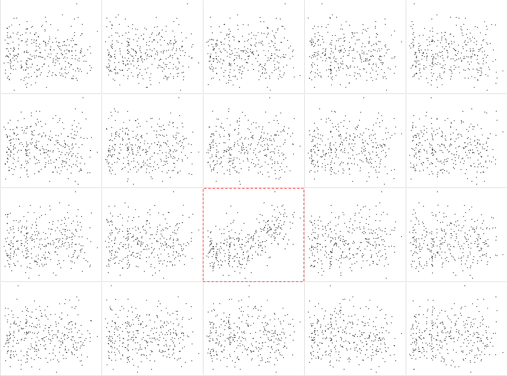
We can even go one step further by adding an abline to the plots. To do this, we need to include the following line of code:
abline(lm(slop$cdu ~ slop$mkath[random]))Code: Adding an abline
# Generate a random plot placement
placement <- sample((1:20), 20)
layout(matrix(placement, 4, 5))

# Plot 19 null plots
par(mar = c(.1, .1, .1, .1))
for(i in 1:19) {
  # Plot random scatter plots of the data
  random <- sample(c(1:dim(slop)[1]), dim(slop)[1])
  plot(slop$mkath[random],
  slop$cdu,
  axes = F,
  ann = F,
  cex = .4)
  # Add the abline to the plots
  abline(lm(slop$cdu ~ slop$mkath[random]))
  # Plot a box with grey lines
  box(bty = "l",
  col = "grey")
}
# Add true plot
plot(slop$mkath,
     slop$cdu,
     axes = F,
     ann = F,
     cex = .4)
abline(lm(slop$cdu ~ slop$mkath)) # Add the abline to the plot
box(bty = "l", # Plot a box with grey lines
    col = "grey")

# Reveal true plot
box(col = "red", # Plot a box with red dashed lines
    lty = 2,
    lwd = 2)
which(placement == 20) # Define the position of the box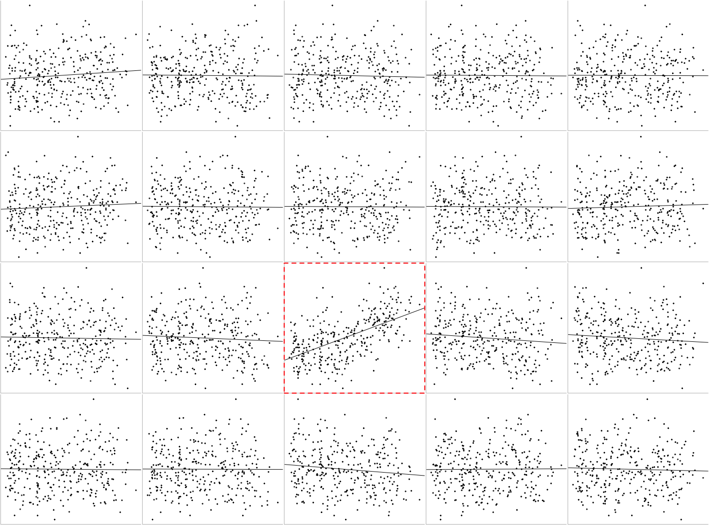
3) Group comparisons
This plot allows us to visually compare two groups: The dataset provides us information about the vote share for the CDU. It also includes a dummy variable that indicates if the constituency is in Bavaria or not. The following plot compares the vote share for the CDU and distinguishes between constituencies within Bavaria (purple) and outside of Bavaria (green).
We need to generate again the 4x5 grid cells with the random plots and the “true” plot. The following code first plots the 19 random scatter plots. As we can see, we get a 4x5 grid cell with 19 randomly assigned scatter plots and one empty cell. We now proceed and fill again this empty cell with the “true” data and plot a box around it.
Code: Create group comparison
# Generate random plot placement
placement <- sample((1:20), 20)
layout(matrix(placement, 4, 5))

# Plot 19 Null Plots
par(mar = c(.1, .1, .1, .1))
for (i in 1:19) {
  random <- sample(c(1:dim(slop)[1]), dim(slop)[1])

  plot(
    slop$bayern[random],
    slop$cdu,
    axes = F,
    ann = F,
    cex = .4,
    xlim = c(-1, 2)
    )
  points(1,
         mean(slop$cdu[slop$bayern[random] == 1]),
         pch = "-",
         col = "purple4",
         cex = 3)
  points(0,
         mean(slop$cdu[slop$bayern[random] == 0]),
         pch = "-",
         col = "darkolivegreen2",
         cex = 3)
  box(bty = "l", col = "grey")

}

# Add true plot
plot(
  slop$bayern,
  slop$cdu,
  axes = F,
  ann = F,
  cex = .4,
  xlim = c(-1, 2)
  )
points(1,
       mean(slop$cdu[slop$bayern == 1]),
       pch = "-",
       col = "purple4",
       cex = 3)
points(0,
       mean(slop$cdu[slop$bayern == 0]),
       pch = "-",
       col = "darkolivegreen2",
       cex = 3)
box(bty = "l", col = "grey")

# Reveal True Plot
box(col = "red", lty = 2, lwd = 2)
which(placement == 20)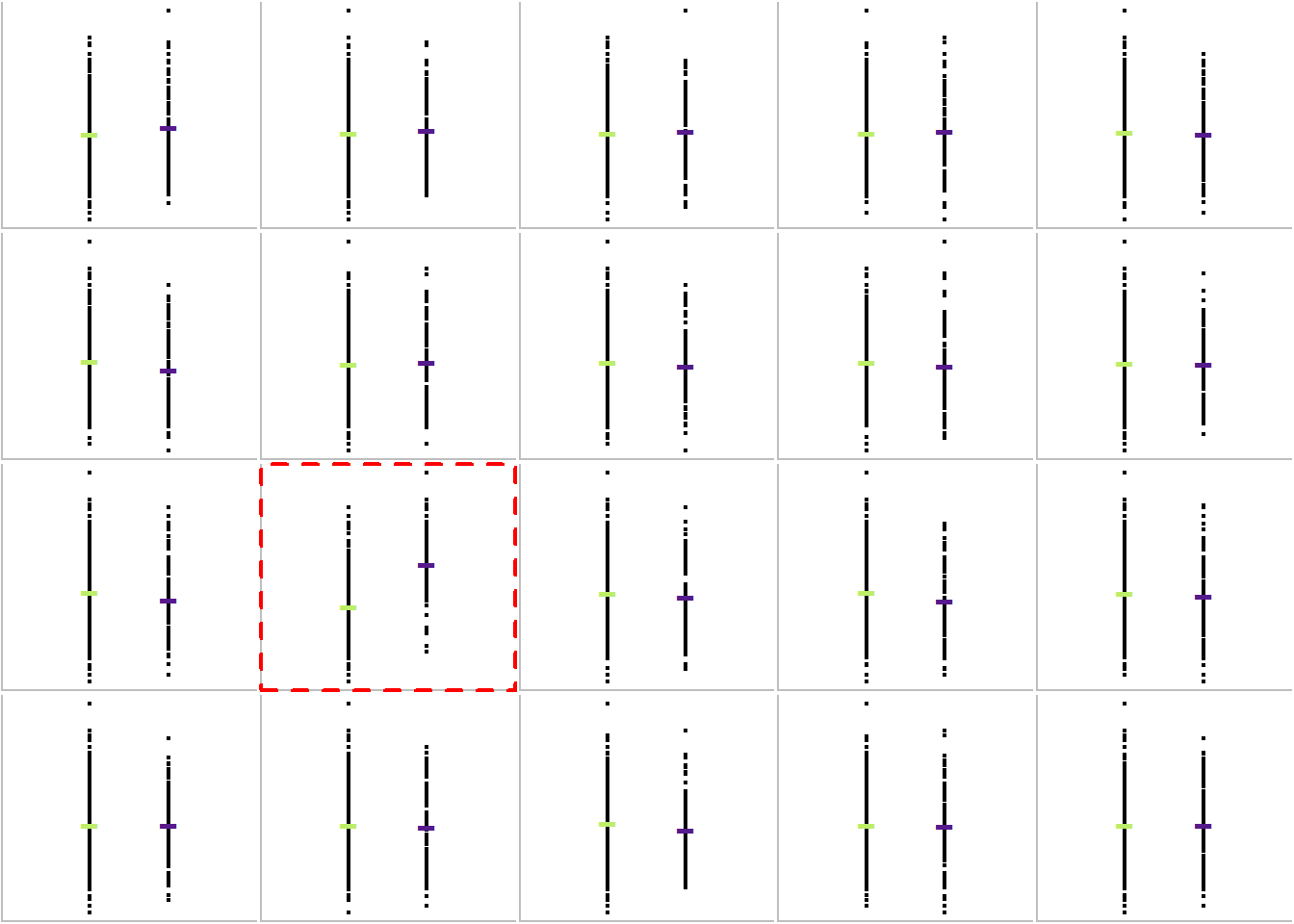
Further readings
- Buja, A., Cook, D., Hofmann, H., Lawrence, M., Lee, E. K., Swayne, D. F., & Wickham, H. (2009). Statistical inference for exploratory data analysis and model diagnostics. Philosophical Transactions of the Royal Society A: Mathematical, Physical and Engineering Sciences, 367(1906), 4361-4383.
- Few, S. (2009). Now you see it: simple visualization techniques for quantitative analysis. Analytics Press.
- Gelman, A. (2003). A Bayesian formulation of exploratory data analysis and goodness‐of‐fit testing. International Statistical Review, 71(2), 369-382.
- Gelman, A. (2004). Exploratory data analysis for complex models. Journal of Computational and Graphical Statistics, 13(4), 755-779.
- Traunmüller, R. Visual statistical inference for political research.
- Wickham, H., Cook, D., Hofmann, H., & Buja, A. (2010). Graphical inference for infovis. IEEE Transactions on Visualization and Computer Graphics, 16(6), 973-979.
About the presenter
Richard Traunmüller is a Visiting Associate Professor of Political Science at the University of Mannheim and currently on leave from Goethe University Frankfurt, where he is an Assistant Professor of Empirical Democracy Research. He has a strong interest in Bayesian analysis, data visualization, and survey experiments. He studies challenges that arise from deep-seated societal change: global migration and religious diversity, free speech in the digital age, as well as the legacies of civil war and sexual violence.
