regplane3D: Plotting 3D regression predictions in R
The interpretation and presentation of empirical findings from (generalized) linear models has come a long way in the social sciences. Researchers increasingly visualize substantively meaningful quantities of interest such as expected values, first differences, and average marginal effects and consistently include uncertainty estimates in the form of analytical, simulation-based, or bootstrapped confidence intervals.
However, existing interpretations and presentations are typically restricted to bivariate patterns which show (changes in) expected values as function of a single predictor, holding all else constant. This can be a significant limitation, especially when substantive inquiries focus on the interplay of two variables in predicting an outcome. To interpret and visualize such applications effectively, researchers must extend their presentations to include a third dimension.
In this Methods Bites Tutorial, Denis Cohen and Nick Baumann introduce and showcase the regplane3D package, a tool for plotting 3D regression predictions in R.
After reading this blog post and engaging with the applied examples, readers will be able to:
- generate the quantities of interest from regression models, including expected values over a grid of predictor values and their confidence intervals.
- plot these quantities in three-dimensional visualizations using
regplane3D.
Overview
The regplane3D package
The regplane3D package is a
convenience wrapper for Karline Soetaert’s
plot3D package.
regplane3D uses several plot3D functions to produce visually appealing
three-dimensional displays of regression estimates with confidence intervals.
For example, the package can be used to plot conditional expected values
of an outcome variable \(Z\) over the joint distribution of two continuous
predictors, \(X\) and \(Y\), i.e., \(\mathbb{E}(Z|X,Y)\).
regplane3D
(development version 0.1.0) consists of the following functions:
plane3D: Plot a three-dimensional regression prediction with confidence intervals.twoplanes3D: Plot a three-dimensional regression prediction with two planes, typically separated at a cut point in one of the two horizontal dimensions, with their respective confidence intervals.heatmap3D: Auxiliary function for adding three-dimensional heatmaps to plots produced by eitherplane3Dortwoplanes3D. These heatmaps show the joint frequency/density distribution of the model predictors represented on the horizontal axes of the plots.pretty_axis_inputs: Auxiliary function for generating inputs for prediction and plotting to ensure that the grid lines of the perspective box and the lines of the grid lines of the regression planes match.
regplane3D is developed and maintained by
Denis Cohen (author, creator) with the help
of Nick Baumann (contributor).
Installation
To install the latest development version of regplane3D from GitHub, run:
## devtools
if (!("devtools" %in% installed.packages()))
  install.packages("devtools")
library(devtools)

## regplane3D
if (!("regplane3D" %in% installed.packages()))
  devtools::install_github("denis-cohen/regplane3D")
library(regplane3D)
Prerequisites
The use of regplane3D functions requires that users provide the following inputs:
- A vector containing a sequence of values for the first predictor, \(X\).
- A vector containing a sequence of values for the second predictor, \(Y\).
- A matrix containing the expected values of \(Z\), or an array containing the expected values as well as their lower and upper confidence interval bounds, for all combinations of the specified values for \(X\) and \(Y\).
- Optional: A matrix containing the discretized joint density or joint frequency of \(X\) and \(Y\).
We illustrate how these inputs can be generated in some applied examples below.
For all illustrations, we will use the regplane3D’s internal data set us, a
small data set containing information on incumbent vote shares,
approval ratings, and economic growth rates in US Presidential Elections between
1948 and 2004. For a documentation of the data, see ?regplane3D::us.
Motivation
A staple of introductory statistics classes is the notion that model predictions from a linear model are no longer represented by line in two dimensions but by a plane in three dimensions once we extend the simple bivariate regression model to include an additional continuous predictor. Graphical representations of model predictions are widespread for the bivariate case. Most commonly, these appear in the form of conditional expected values of an outcome variable as a function of a key predictor while holding other covariates constant. The Figure below exemplifies this by showing the effect of economic growth on incumbent vote shares in US presidential elections, holding incumbents’ approval rating constant at its sample mean.
R code: Estimation, prediction, and visualization
## ---- Estimation ----
mod <- lm(vote ~ growth + approval, dat = us)

## ---- Prediction ----
growth_vals <- seq(-4, 6, length.out = 101L)
pred <- predict.lm(
      mod,
      newdata = data.frame(growth = growth_vals,
                           approval = mean(us$approval)),
      se.fit = TRUE
    )

## ---- Visualization ----
x_lines <-  seq(-4, 6, 2)
y_lines <- seq(40, 60, 5)

## Canvas
plot(
  1,
  1,
  type = 'n',
  main = "Economic Growth and Incumbent Vote Shares",
  axes = F,
  xlab = "Economic Growth",
  ylab = "E[Incumbent Vote Share]",
  ylim = range(y_lines),
  xlim = range(x_lines)
)
axis(2, outer = FALSE)
axis(1)
rect(
  min(x_lines),
  min(y_lines),
  max(x_lines),
  max(y_lines),
  col = "gray95",
  border = NA
)
for (y in y_lines)
  segments(min(x_lines),
           y,
           max(x_lines),
           y,
           col = "white",
           lwd = 2)
for (x in x_lines)
  segments(x,
           min(y_lines),
           x,
           max(y_lines),
           col = "white",
           lwd = 2)

## Prediction
polygon(
  c(growth_vals, rev(growth_vals)),
  c(
    pred$fit + qnorm(.025) * pred$se.fit,
    rev(pred$fit + qnorm(.975) * pred$se.fit)
  ),
  col = adjustcolor("gray30", alpha.f = .2),
  border = NA
)
lines(growth_vals,
      pred$fit,
      lty = 1,
      col = "gray10",
      lwd = 2)
lines(growth_vals,
      pred$fit + qnorm(.025) * pred$se.fit,
      lty = 1,
      col = "gray30")
lines(growth_vals,
      pred$fit + qnorm(.975) * pred$se.fit,
      lty = 1,
      col = "gray30")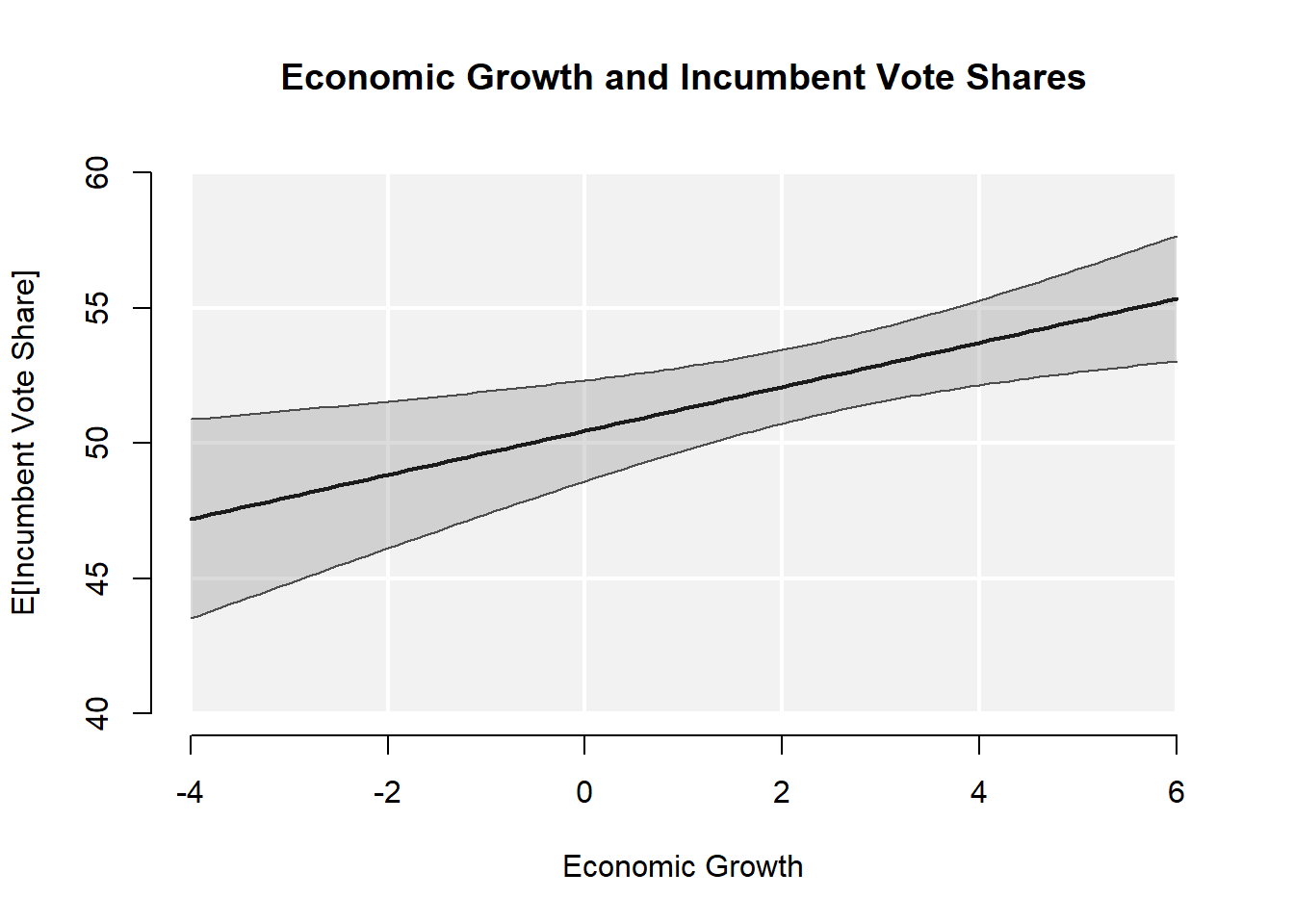
This display of conditional expected values allows readers to grasp at a glance how the expected value of an outcome \(Z\) changes along a range of values \(\overrightarrow{x}\) of a given predictor \(X\). As such, it is both highly informative and easily accessible even to non-technical audiences. Yet, graphically conveying the same information when we want to know how expected values vary as a joint function of two predictors, i.e. \(\mathbb{E}[Z | X, Y]\), remains a difficult enterprise. This is especially true when researchers wish to include inferential uncertainty in the form confidence intervals. Among the most common alternatives, researchers typically
- separately report marginal effects of \(X\) and \(Y\) on \(Z\), i.e. \(\frac{\partial \mathbb{E}[Z | X, Y]}{\partial X}\) and \(\frac{\partial \mathbb{E}[Z | X, Y]}{\partial Y}\),
- selectively report point estimates of conditional expected at characteristic value pairs \(\{x^\prime, y^\prime\}\) of \(X\) and \(Y\), i.e. \(\mathbb{E}[Z | X = x^\prime, Y = y^\prime]\), or
- selectively report conditional expected values of \(Z\) along a range values \(\overrightarrow{x}\) of \(X\) while fixing \(Y\) at some characteristic value(s) \(y^\prime\) (or vice versa), i.e. \(\mathbb{E}[Z|X=\overrightarrow{x}, Y=y^\prime]\).
While all of these quantities of interest yield valuable insights into the model-based relationships between the three variables, none of them allows researchers to grasp how the prediction of \(\mathbb{E}[Z | X, Y]\) changes over the full grid of plausible value combinations of \(X\) and \(Y\). This is particularly true if the function that maps \(X\) and \(Y\) onto \(\mathbb{E}[Z | X, Y]\) yields a curved surface.1 In this case, readers cannot interpolate the full structure of \(\mathbb{E}[Z | X, Y]\) from the selective information included in displays generated akin to approaches (2) and (3).
regplane3D offers a flexible toolbox that allows users to overcome these
limitations. regplane3D can plot any prediction surface over a two-dimensional
grid with two predictors with the corresponding confidence or credible intervals.
Users must supply these inputs in the form of an array containing the
expected values of \(Z\) as well as their lower and upper
confidence interval bounds over a grid of pre-specified values of \(X\)
and \(Y\). While this means that users must perform the steps of estimation
and prediction before using regplane3D, it also offers users full flexibility
with respect to model types, quantities of interest, and method of
obtaining uncertainty estimates.
Using regplane3D functions
For the sake of illustration, the following
sections will demonstrate the use of regplane3D in the context of conditional expected values from an OLS model with confidence intervals obtained via normal approximation.
plane3D()
Our first example uses the regplane3D::plane3D() function to illustrate
the us in the context of the OLS regression of incumbent vote shares in US
Presidential Elections on incumbent approval ratings and economic growth.
Definition of axis inputs
When using regplane3D plotting functions, it is recommended that users use
regplane3D::pretty_axis_inputs() for defining axis inputs that should be used
for both prediction and plotting.
The reason for this requires some explanation. regplane3D plotting functions
use plot3D::perspbox() to generate the perspective box inside which the
plots are drawn. plot3D::perspbox() in turn depends on graphics::persp(),
which uses the base R function base::pretty() to determine the number of ticks
and reference lines of the perspective box.
As a result of these dependencies, users have limited control over the exact number and placement of ticks and reference lines. For instance, if users were to provide a variable ranging from 1.89 to 24.31 and request four ticks, this suggestion will be overridden with a rounded value range from 0 to 25 and a total of six ticks in integer steps of 5:
pretty(c(1.89, 24.31), n = 4)## [1] 0 5 10 15 20 25Therefore, we recommend that users anticipate this particularity early on and
define their axis inputs such that predictions and their visualization
eventually conform to the grid lines of the perspective box. The function
regplane3D::pretty_axis_inputs() performs these tasks. It rounds value ranges to a
custom base and provides the number and positions of the grid lines in the
perspective box. These can then be used before the plot is generated to
predict the regression plane at the corresponding values. To provide for
smoother curves in plots involving curvilinear planes, the option multiply
ensure that values of the plane are not only calculated at the intersections of
the grid but at finer gradations.
The example below illustrates the functionality. The function extends the
range of the variable us$growth (-3.5969999, 5.914) to a
base of 2, such that the coarsened range is (-4, 6). We suggest that this
range be split into 7 equally spaced intervals. This is rejected by the function,
as such a division would not yield pretty values.
Instead, the function returns
nlines = 6, which means that the lines should be drawn at the reported
linevals of -4, -2, 0, 2, 4, and 6.
When plotting non-linear relationships, grid lines evaluated at such few values
may look a little jerky. To obtain smoother predictions, we can compute our
expected values not just at these coarse values but also at finer gradations
in between. To accomplish this, we can for instance specify multiply = 4,
which means that the linevals sequence in steps of two will be divided into
a finer sequence in steps of 0.5, which is returned as seq.
## Find range of variable
growth_range <- range(us$growth)
growth_range
## [1] -3.597 5.914## Determine axis inputs
growth_axis <- pretty_axis_inputs(
axis_range = growth_range,
base = 2,
nlines_suggest = 7L,
multiply = 4
)
growth_axis## $range
## [1] -4 6
##
## $seq
## [1] -4.0 -3.5 -3.0 -2.5 -2.0 -1.5 -1.0 -0.5 0.0 0.5 1.0 1.5 2.0 2.5 3.0
## [16] 3.5 4.0 4.5 5.0 5.5 6.0
##
## $linevals
## [1] -4 -2 0 2 4 6
##
## $nlines
## [1] 6Estimation and prediction
To obtain the required inputs, we first run a linear regression model of the form
\(\texttt{vote} = \beta_1 + \beta_2 \texttt{growth} + \beta_3 \texttt{approval} +\epsilon\)
and save the estimation results to an object named mod.
## ---- Estimation ----
mod <- lm(vote ~ growth + approval, dat = us)
We then use regplane3D::pretty_axis_inputs() to define the inputs for both axes. This
gives us the sequence of values for each growth and approval.
## ---- Axis inputs ----
## Growth
growth_axis <- pretty_axis_inputs(
  axis_range = range(us$growth),
  base = 2,
  nlines_suggest = 6L,
  multiply = 1
)

## Approval
approval_axis <- pretty_axis_inputs(
  axis_range = range(us$approval),
  base = 10,
  nlines_suggest = 6L,
  multiply = 1
)
For every combination of the values of these two sequences, we subsequently
calculate the expected value and the lower and upper bounds of
its 95% confidence interval using the predict.lm() function with option
se.fit = TRUE.
At each iteration of the nested loop, expected values are temporarily stored in
pred_tmp$fit and standard errors are temporarily stored in pred_tmp$se.fit.
We can extract the expected value and calculate the lower and upper bounds of
the 95% confidence interval at each iteration using
pred_tmp$fit + qnorm(.025) * pred_tmp$se.fit and
pred_tmp$fit + qnorm(.975) * pred_tmp$se.fit, respectively.
We subsequently store the estimate of a given iteration in the appropriate cell
of the array pred.
The array is of dimensions dim = c(length(growth_axis$seq), length(approval_axis$seq), 3L).
The first dimension represents the values of growth_axis$seq, the second dimension
represents the values of approval_axis$seq, and the third dimension represents the
point estimates, lower confidence bounds, and upper confidence bounds.
## ---- Prediction ----
pred <-
  array(NA, dim = c(length(growth_axis$seq), length(approval_axis$seq), 3L))
for (growth in seq_along(growth_axis$seq)) {
  for (approval in seq_along(approval_axis$seq)) {
    pred_tmp <- predict.lm(
      mod,
      newdata = data.frame(growth = growth_axis$seq[growth],
                           approval = approval_axis$seq[approval]),
      se.fit = TRUE
    )
    pred[growth, approval, ] <- c(
      pred_tmp$fit,
      pred_tmp$fit + qnorm(.025) * pred_tmp$se.fit,
      pred_tmp$fit + qnorm(.975) * pred_tmp$se.fit
    )
  }
}
Note: The prediction step can (and should) be adopted to fit the requirements of a given empirical application. For instance, the calculation of expected values from generalized linear models requires the specification of scenarios for the covariate values, the application of an inverse link function, and the use of bootstrapping or parameter simulation for the construction of confidence intervals (though the last step may be skipped in favor of analytical confidence intervals based on normal approximation if the sampling distribution of the quantity of interest is approximately normal). For more information on the calculation of quantities of interest in generalized linear models, see the Further reading section.
Plotting
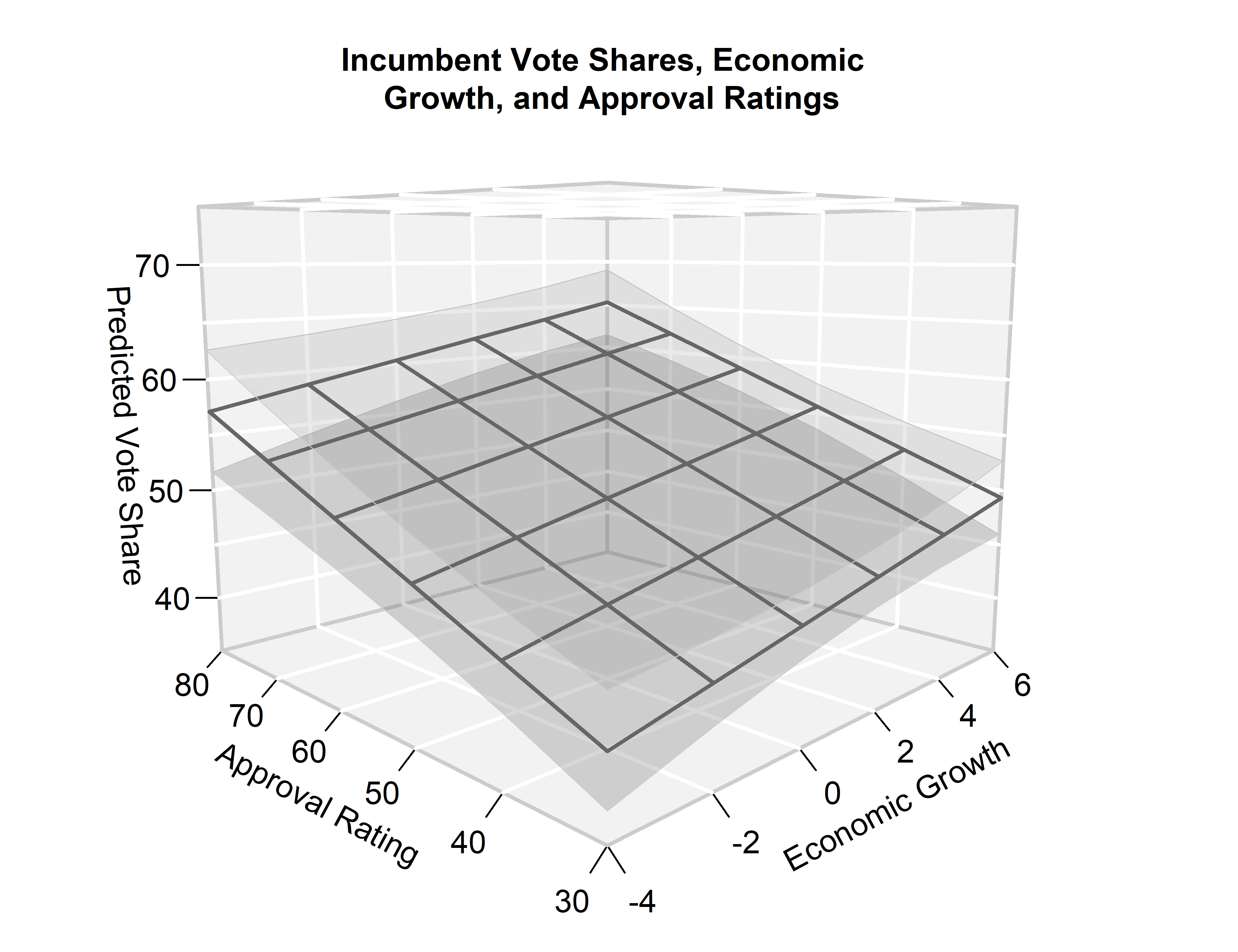
Using these estimates, we can then plot our regression plane using
plane3D().
We pass the inputs z = pred, x = growth_axis$seq, and
y = approval_axis$seq to the
function, which contain all required information to plot the regression plane.
The point estimate of the regression line is plotted by default.
Confidence intervals are added per the option cis = TRUE.
For additional options, see ?regplane3D::plane3D.
## ---- Plot ----
par(mar = c(2.1, 2.1, 4.1, 0.1))
plane3D(
  z = pred,
  x = growth_axis$seq,
  y = approval_axis$seq,
  zlab = "Predicted Vote Share",
  xlab = "Economic Growth",
  ylab = "Approval Rating",
  zlim = c(35, 75),
  xlim = growth_axis$range,
  ylim = approval_axis$range,
  cis = TRUE,
  xnlines = growth_axis$nlines,
  ynlines = approval_axis$nlines,
  main = "Incumbent Vote Shares, Economic \n Growth, and Approval Ratings",
  theta = -45,
  phi = 9
)
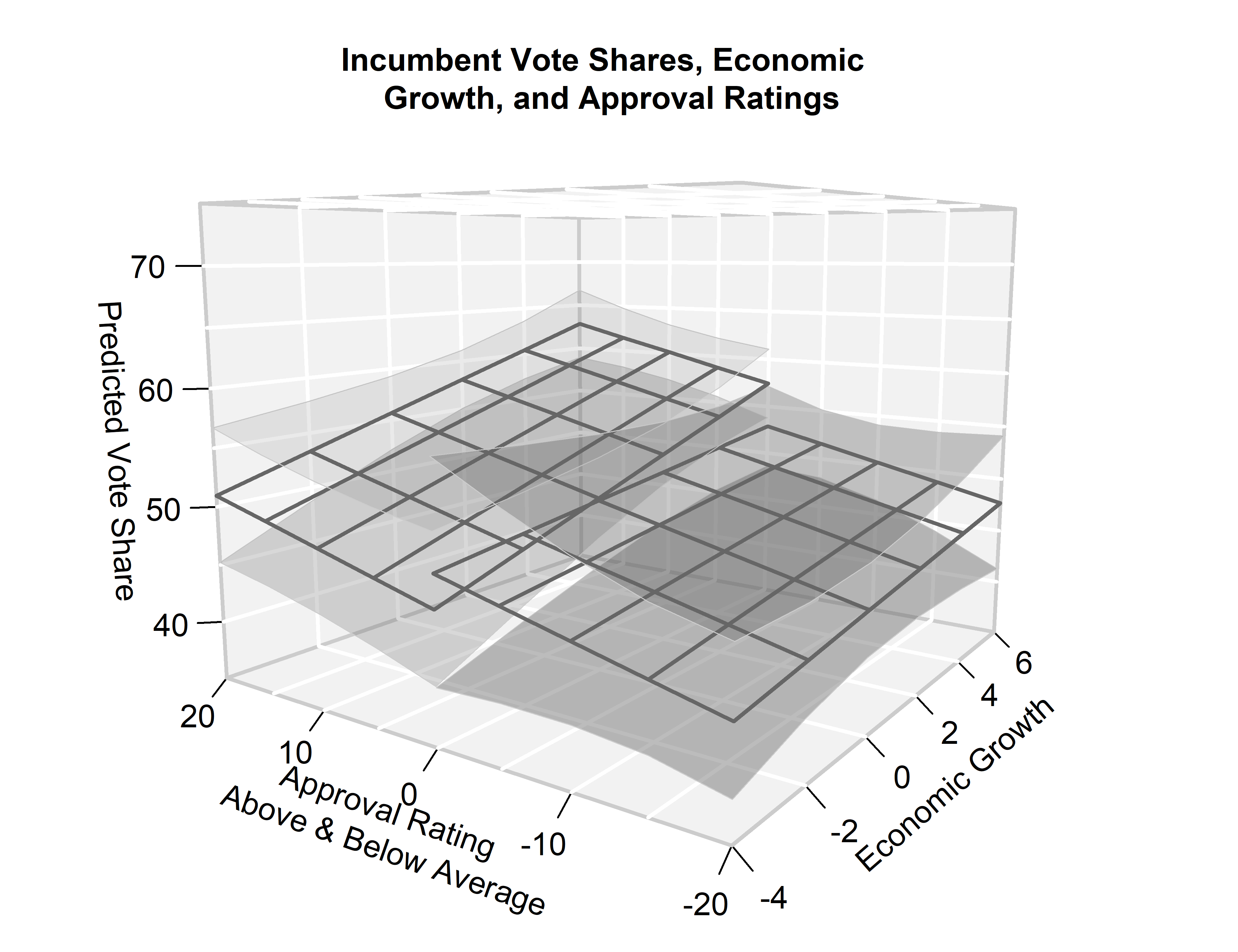
twoplanes3D()
The regplane3D::twoplanes3D() function extends the functionality of
regplane3D::plane3D() to
accommodate two separate planes. These are typically required when the
model prediction is distinct to specific value ranges separated by a cut point
in one of the two horizontal dimensions, akin to a discontinuity or binary
spline.
We showcase the function by replicating the empirical example introduced above, now with distinct predictions for incumbent presidents with above-average and below-average approval ratings, respectively.
Axis inputs, estimation and prediction
Axis inputs, estimation and prediction are now slightly more intricate than in
the previous example. First, we interact both model
predictors with the binary indicator approval_above_mean.
We then define the axis input for the cut axis (i.e., centered_approval) from
its minimum value up to the cut_pointof 0.
We store the expected values and confidence bounds across the values of
growth_axis$range
and approval values ranging from min(centered_approval) up to the cut point of
0 in pred[, , 1, ] for the prediction with below-average approval ratings.
Analogously, we store this information for the prediction with above-average
approval ratings in pred[, , 2, ], where the values of centered_approval
now range from the cut point of up to abs(min(centered_approval)) to provide
for a symmetrical value range and display.
R code: Estimation and prediction
## ---- Estimation ----
mod2 <-
  lm(vote ~
       growth +
       centered_approval +
       approval_above_mean +
       growth:approval_above_mean +
       centered_approval:approval_above_mean,
     dat = us)

## ---- Axis inputs ----
## Cut point
cut_point <- 0
approval_above_mean_vals <- c(0, 1)

## Growth
growth_axis2 <- pretty_axis_inputs(
  axis_range = range(us$growth),
  base = 2,
  nlines_suggest = 6L,
  multiply = 1
)

## Approval
approval_axis2 <- pretty_axis_inputs(
  axis_range = c(min(us$centered_approval), cut_point),
  base = 10,
  nlines_suggest = 3L,
  multiply = 1
)

## ---- Prediction ----
pred2 <-
  array(NA, dim = c(length(growth_axis2$seq), length(approval_axis2$seq), 2L, 3L))
for (growth in seq_along(growth_axis2$seq)) {
  for (centered_approval in seq_along(approval_axis2$seq)) {
    for (approval_above_mean in seq_along(approval_above_mean_vals)) {
      pred_tmp <- predict.lm(
        mod2,
        newdata = data.frame(
          growth = growth_axis2$seq[growth],
          centered_approval = approval_axis2$seq[centered_approval] -
            min(approval_axis2$seq) *
            approval_above_mean_vals[approval_above_mean],
          approval_above_mean = approval_above_mean_vals[approval_above_mean]
        ),
        se.fit = TRUE
      )

      pred2[growth, centered_approval, approval_above_mean,] <-
        c(
          pred_tmp$fit,
          pred_tmp$fit + qnorm(.025) * pred_tmp$se.fit,
          pred_tmp$fit + qnorm(.975) * pred_tmp$se.fit
        )
    }
  }
}
Plotting
Plotting with regplane3D::twoplanes3D() works the same way as with
regplane3D::plane3D(), except
we now must provide the \(x\), \(y\) and \(z\) values separately for both planes.
For this, we use the inputs x and x2, y and y2, as well as z and z2.
## ---- Plot ----
par(mar = c(2.1, 2.1, 4.1, 0.1))
twoplanes3D(
  z = pred2[, , 1,],
  x = growth_axis2$seq,
  y = approval_axis2$seq,
  z2 = pred2[, , 2,],
  x2 = growth_axis2$seq,
  y2 = approval_axis2$seq - min(approval_axis2$seq),
  zlim = c(35, 75),
  xlim = growth_axis2$range,
  ylim = c(min(approval_axis2$seq),-min(approval_axis2$seq)),
  zlab = "Predicted Vote Share",
  xlab = "Economic Growth",
  ylab = "Approval Rating \n Above & Below Average",
  cis = TRUE,
  xnlines = growth_axis2$nlines,
  ynlines = approval_axis2$nlines,
  main = "Incumbent Vote Shares, Economic \n Growth, and Approval Ratings",
  theta = -55,
  phi = 9
)
Extensions
Plot produced with either regplane3D::plane3D() or regplane3D::twoplanes3D()
can be extended in numerous ways.
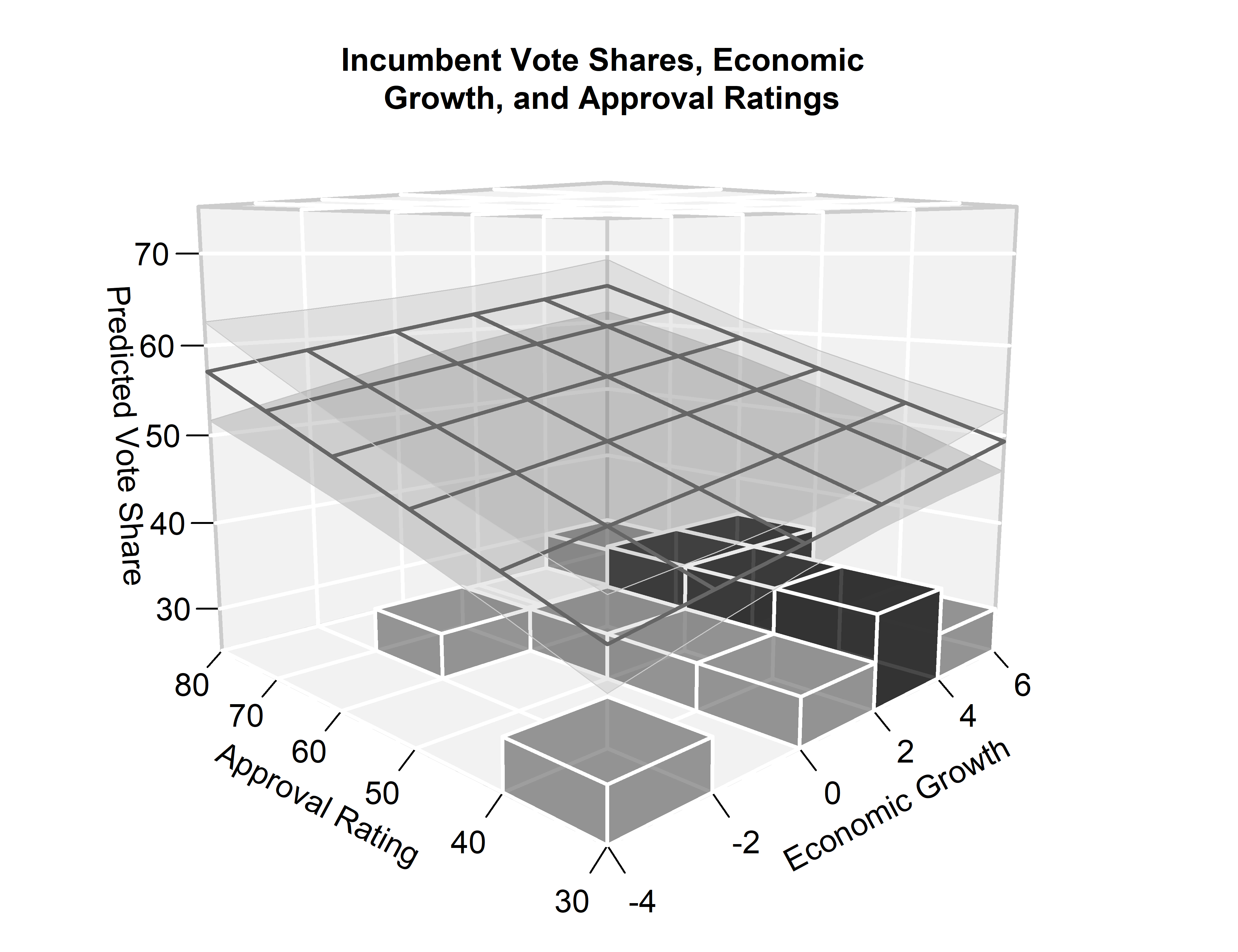
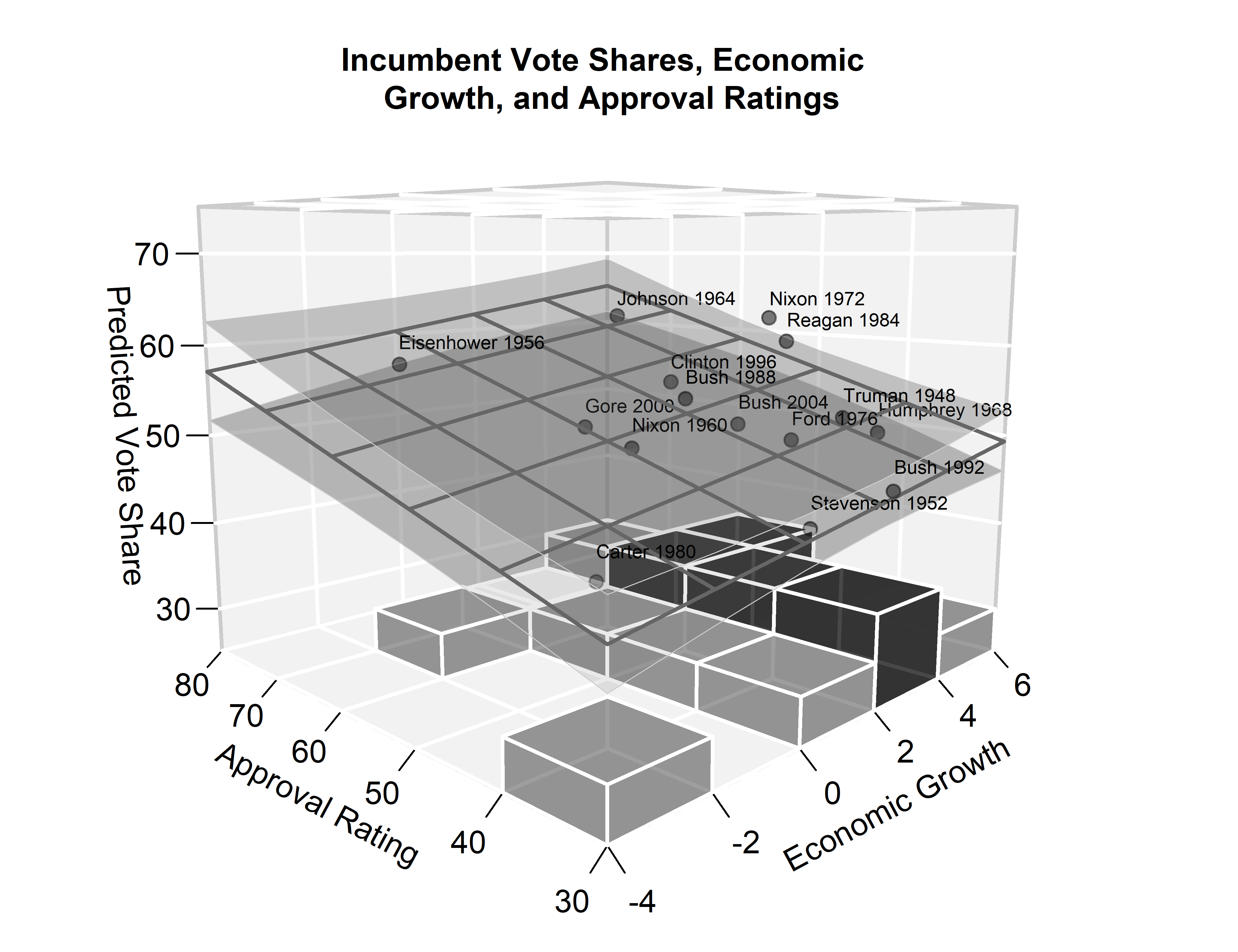
For one, we can use regplane3D::heatmap3D() to add a
three-dimensional histogram that shows the joint frequency or density
distribution of the predictor variables growth and approval.
Toward this end, we must first compute a matrix of the joint frequency along
discrete intervals of the two continuous predictors. For appealing visuals,
it is recommended that the partition of the discrete intervals corresponds
to the grid lines of the main plot. These values are returned in the
linevals entry of the output returned by regplane3D::pretty_axis_inputs().
## Heatmap values
growth_cat <- cut(us$growth, breaks = growth_axis$linevals)
approval_cat <- cut(us$approval, breaks = approval_axis$linevals)
joint_frequency <- table(growth_cat, approval_cat)
We can then add the three-dimensional heatmap by adding the option
heatmap = joint_frequency to our regplane3D::plane3D() command:
## ---- Plot ----
par(mar = c(2.1, 2.1, 4.1, 0.1))
par(mar = c(2.1, 2.1, 4.1, 0.1))
plane3D(
  z = pred,
  x = growth_axis$seq,
  y = approval_axis$seq,
  zlab = "Predicted Vote Share",
  xlab = "Economic Growth",
  ylab = "Approval Rating",
  zlim = c(35, 75),
  xlim = growth_axis$range,
  ylim = approval_axis$range,
  cis = TRUE,
  xnlines = growth_axis$nlines,
  ynlines = approval_axis$nlines,
  main = "Incumbent Vote Shares, Economic \n Growth, and Approval Ratings",
  theta = -45,
  phi = 9,
  heatmap = joint_frequency
)
As the regplane3D package is a convenience wrapper for the plot3D package,
plots produced by regplane3D plotting functions can be supplemented with
output from plot3D functions (using the option add = TRUE).
For instance, we can add the observed values of the outcome variable
using plot3D::points3D() and add text labels using plot3D::text3D().
## ---- Plot ----
par(mar = c(2.1, 2.1, 4.1, 0.1))
plane3D(
  z = pred,
  x = growth_axis$seq,
  y = approval_axis$seq,
  zlab = "Predicted Vote Share",
  xlab = "Economic Growth",
  ylab = "Approval Rating",
  zlim = c(35, 75),
  xlim = growth_axis$range,
  ylim = approval_axis$range,
  cis = TRUE,
  xnlines = growth_axis$nlines,
  ynlines = approval_axis$nlines,
  main = "Incumbent Vote Shares, Economic \n Growth, and Approval Ratings",
  theta = -45,
  phi = 9,
  heatmap = joint_frequency
)
plot3D::points3D(
  z = us$vote,
  x = us$growth,
  y = us$approval,
  add = TRUE,
  col = adjustcolor("black", alpha.f = .3),
  pch = 19
)
plot3D::text3D(
  z = us$vote + 2.5,
  x = us$growth,
  y = us$approval,
  labels = us$incumbent,
  add = TRUE,
  cex = 0.6
)
Conclusion
An increasing number of empirical applications in quantitative social science
focuses on the interplay of two predictors in determining the expected levels
of an outcome. Making sense of such analyses requires interpreting the expected
values of an outcome variable over the joint distribution of two predictors.
Existing visualizations, however, are typically limited to bivariate displays
which show the expected values of the outcome variable as a function of a
single predictor, fixing the respective other predictor at some characteristic
value and holding background covariates constant. To overcome this limitation,
this blog post has introduced the regplane3D package and showcased its
functionality. Practitioners can now use this tool to produce visually appealing
three-dimensional displays of regression estimates with confidence intervals.
Citation
When using regplane3D, please acknowledge the work that has gone into the
development of the package and its dependencies.
R code: Package citations
citation("regplane3D")##
## To cite package 'regplane3D' in publications use:
##
## Denis Cohen (2021). regplane3D: Plotting Regression Predictions in
## 3D. R package version 0.1.0.
## https://github.com/denis-cohen/regplane3D
##
## A BibTeX entry for LaTeX users is
##
## @Manual{,
## title = {regplane3D: Plotting Regression Predictions in 3D},
## author = {Denis Cohen},
## year = {2021},
## note = {R package version 0.1.0},
## url = {https://github.com/denis-cohen/regplane3D},
## }citation("plot3D")##
## To cite package 'plot3D' in publications use:
##
## Karline Soetaert (2019). plot3D: Plotting Multi-Dimensional Data. R
## package version 1.3. https://CRAN.R-project.org/package=plot3D
##
## A BibTeX entry for LaTeX users is
##
## @Manual{,
## title = {plot3D: Plotting Multi-Dimensional Data},
## author = {Karline Soetaert},
## year = {2019},
## note = {R package version 1.3},
## url = {https://CRAN.R-project.org/package=plot3D},
## }
##
## ATTENTION: This citation information has been auto-generated from the
## package DESCRIPTION file and may need manual editing, see
## 'help("citation")'.Further reading
- Cohen, Denis (2020). Week 11: Logit and Probit Models. Lecture “Quantitative Methods”, School of Social Sciences, University of Mannheim.
- Meyer, Cosima and Dennis Hammerschmidt (2020). How to write your own R package and publish it on CRAN. Methods Bites – Blog of the MZES Social Science Data Lab.
- Meyer, Cosima and Richard Traunmüller (2019). Data Visualization with R. Methods Bites – Blog of the MZES Social Science Data Lab.
- Neunhoeffer, Marcel and Oliver Rittmann (2020). Lab Materials “Quantitative Methods”, School of Social Sciences, University of Mannheim.
- Soetaert, Karline (2019). plot3D: Plotting Multi-Dimensional Data. R package version 1.3.
- Wickham, Hadley and Jenny Bryan (2021). R Packages: Organize, Test, Document and Share Your Code. Work-in-progress 2nd Edition.
When moving beyond the simple case of additive linear regression, we deal with generalized surface structures. For instance, predictions from multivariate linear models that accommodate non-linear relationships or interaction effects as well as predictions from multivariate generalized linear models typically involve surfaces with some curvature. These are generalize flat planes in the same way that curves generalize lines with a constant slope.↩︎
