Data Visualization with R
How to make the invisible visible was the starting point of Richard Traunmüller’s one-day workshop in the MZES Social Science Data Lab in Fall 2016. This Methods Bites Tutorial by Cosima Meyer provides you with some illustrative examples from Richard’s workshop. What, for instance, do you think the following graph might be?
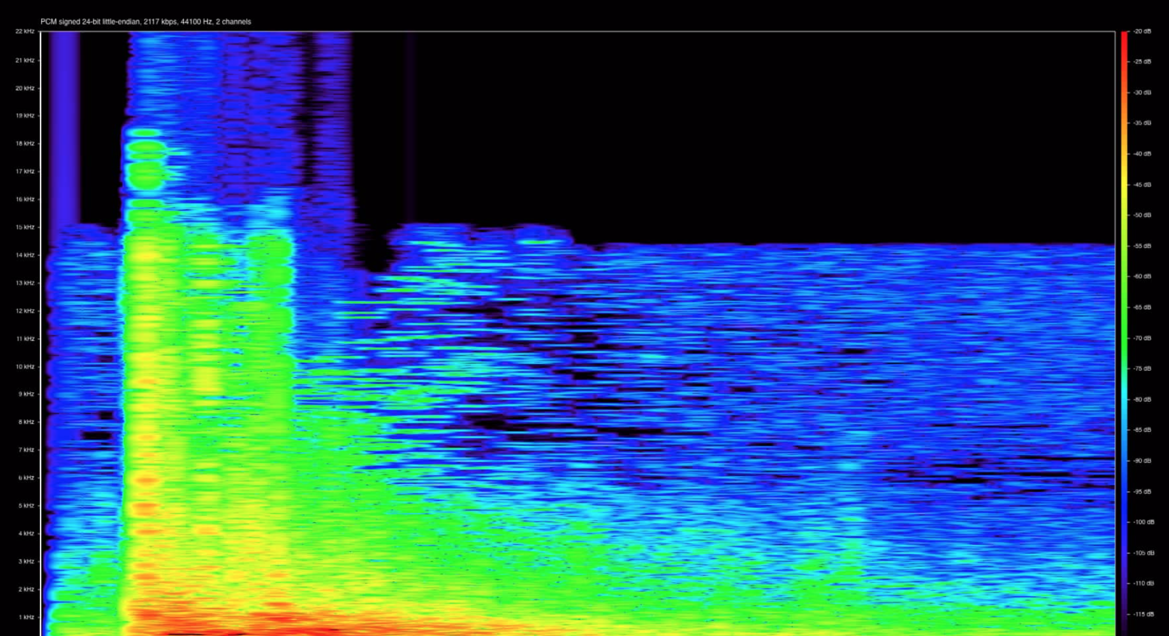
Figure 1: Sound of a pistol-shot (http://beitunia.forensic-architecture.org/sound-analysis/test-data/)
Here you see the visualization of a pistol-shot. Visualizing data is an art itself and Richard offered the course participants an incredibly dense overview of how to do it best. Starting with Tufte’s seminal ink-data ratio, Richard presented a variety of different visualization methods, talked about visual perception, ‘apophenica’ (the tendency to see pattern in random data), addressed visual inference and concerns with exploratory data analysis, and delved into sensitivity analysis.
This blog post includes:
Note: This blog post presents Richard’s workshop materials in condensed form. The full materials (slides and replication files) can be obtained from our GitHub.
Toolkit of graphical visualization
Richard provided the course participants with a large toolkit of different plots in R, e.g. bubble plots, heat maps, mosaic plots, parallel coordinate plots, plotted hexagonally binned data, and also showed how to visualize contingency tables. The following section gives you a short overview of advanced visualizations and gives you the code that allows you to implement the following graphics for your own data. For a broader insight in the toolkit, please see the code and the slides here.
Bubble plots
Bubble plots (see slides 150 ff.) are similar to scatter plots but allow us to control for the different sizes of each observation. While you only need two input variables for a scatter plot (represented on the X and Y axis), you need a third input variable that is represented by the size of the bubble for the bubble plot. The example below shows both a scatter plot and a bubble plot for the vote share of Germany’s conservative party CDU/CSU (in %) and the share of Catholics (in %). The bubble plot adds a third dimension to the regular scatter plot and also controls for the population size of the constituency with the size of the bubbles. It is important to note that the size of the bubbles must be proportional to the area (not radius) - otherwise you risk to exaggerate the variation in the data.
Code: Scatter plot
plot(
  # Data for x-axis
  daten05$kath,
  # Data for y-axis
  daten05$cdu,
  # Type of plotting symbol
  pch = 1,
  # Suppresses both x and y axes
  axes = FALSE,
  # Scaling of labels relative to "cex" (default is 1)
  cex.lab = 1,
  # Label the title of the figure (empty here)
  main = "",
  # Label of x-axis
  xlab = "Share of Catholics %",
  # Label of y-axis
  ylab = "Vote Share CDU/CSU %",
  # Labels are parallel (=0) or perpendicular(=2) to axis
  las = 1
  )
axis(
  2,
  # Ticks of the axis
  at = seq(.10, .60, by = .10),
  # Define labels of the axis
  labels = c("10", "20", "30", "40", "50", "60"),
  # Labels are parallel (=0) or perpendicular(=2) to axis
  las = 1,
  # Length of tick mark as fraction of plotting region (default: -0.01)
  tck = -.01,
  )
axis(
  1,
  # Ticks of the axis
  at = seq(.20, .80, by = .20),
  # Define labels of the axis
  labels = c("20", "40", "60", "80"),
  # Labels are parallel (=0) or perpendicular(=2) to axis
  las = 1,
  # Length of tick mark as fraction of plotting region (default: -0.01)
  tck = -.01,
  )
box(bty = "l")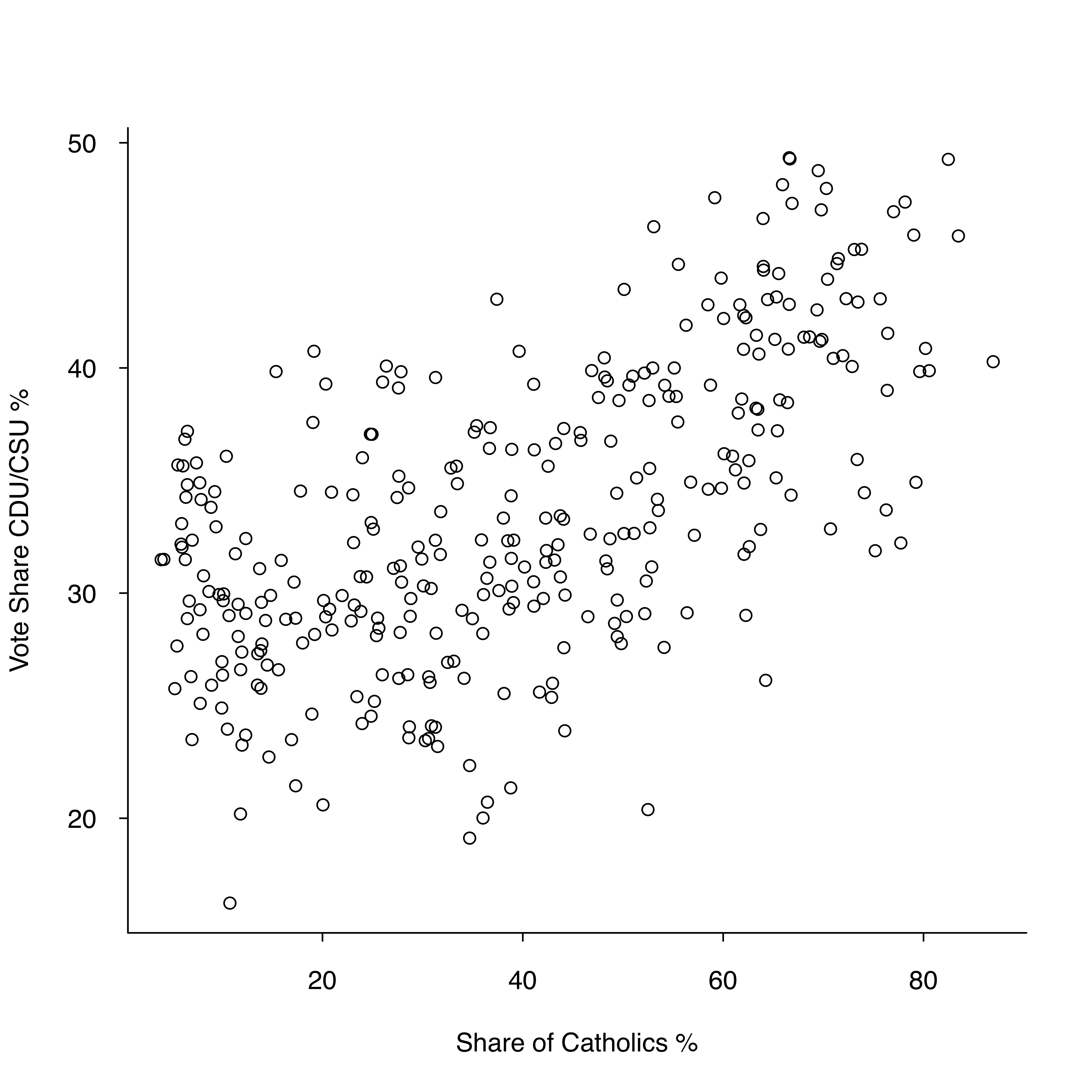
Figure 2: Scatter plot
Code: Bubble plot
# Load Packages
library(arm) # Package for data analysis using regression and multilevel/hierarchical models
library(foreign) # Package required for reading and writing datasets with other formats than Rdata
library(RColorBrewer) # Package that provides color schemes for maps

# Load and Generate Data
# Read data
daten05 <-
  read.dta("~/Downloads/DMU/DataVis/slop_bw2005_agg.dta")
# Create a dummy ("bayern") indicating that for kreis > 9000 and < 10000 equals 1
daten05$bayern[daten05$kreis > 9000 & daten05$kreis < 10000] <- 1
# Create a dummy ("bayern") indicating that for kreis < 9000 and > 10000 equals 0
daten05$bayern[daten05$kreis < 9000 | daten05$kreis > 10000] <- 0
# Create a variable "badwue" with 0
daten05$badwue <- 0
# Replace "badwue" with 1 if kreis == 8000
daten05$badwue[daten05$kreis > 8000 & daten05$kreis < 8000] <- 1

# Bubble plot
plot(
  # Data for x-axis
  daten05$kath,
  # Data for y-axis
  daten05$cdu,
  # Type of plotting symbol (no plotting symbol because we include the bubbles later)
  pch = "",
  # Suppresses both x and y axes
  axes = FALSE,
  # Scaling of labels relative to "cex" (default is 1)
  cex.lab = 1,
  # Label the title of the figure (empty here)
  main = "",
  # Label of x-axis
  xlab = "Share of Catholics %",
  # Label of y-axis
  ylab = "Vote Share CDU/CSU %",
  # Labels are parallel (=0) or perpendicular(=2) to axis
  las = 1
  )

# Make adjustments for the y-axis
axis(
  2,
  # Ticks of the axis
  at = seq(.10, .60, by = .10),
  # Define labels of the axis
  labels = c("10", "20", "30", "40", "50", "60"),
  # Scaling of axis relative to "cex" (default is 1)
  cex.axis = 1,
  # Labels are parallel (=0) or perpendicular(=2) to axis
  las = 1,
  # Length of tick mark as fraction of plotting region (default: -0.01)
  tck = -.01
  )

# Make adjustments for the x-axis
axis(
  1,
  # Ticks of the axis
  at = seq(.20, .80, by = .20),
  # Define labels of the axis
  labels = c("20", "40", "60", "80"),
  # Scaling of axis relative to "cex" (default is 1)
  cex.axis = 1,
  # Labels are parallel (=0) or perpendicular(=2) to axis
  las = 1,
  # Length of tick mark as fraction of plotting region (default: -0.01)
  tck = -.01
  )

# Defines the box type
box(bty = "l")

# Add bubbles
symbols(
  # Refer to the data
  daten05$kath,
  # You need to size the bubbles proportional to area (not radius)
  daten05$cdu,
  circles = sqrt(daten05$n / pi),
  # Relativ size of the bubble
  inches = 0.5,
  # Define the color (background)
  bg = rgb(120, 00, 120, 50, max = 255),
  # Define the color (foreground)
  fg = rgb(120, 00, 120,  max = 255),
  # Add the symbols to the plot
  add = TRUE
) 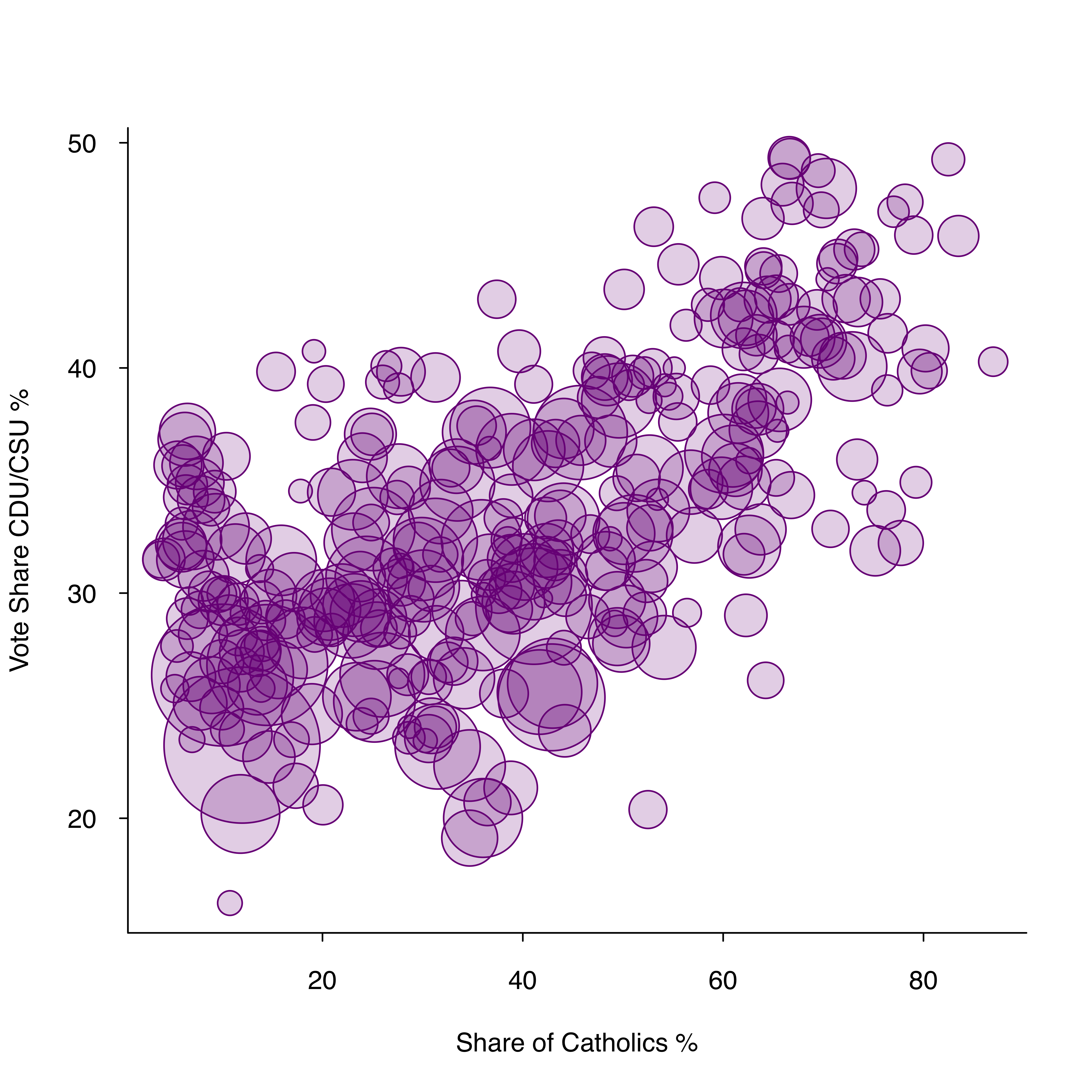
Figure 3: Bubble plot
The code is based on the full code that can be found in the file “Correlation.R”.
Hexbin plots
To visualize how to reduce overplotting, Richard used a “Big Data” example (see slide 145 ff.) and the hexbinplot() function from the hexbin package. The density encoding allows us to intuitively grasp highly frequented areas where more basic plots (e.g. scatter plots) would fail. A simple comparison between a scatter plot and a hexbin plot reveals the clear advantage of hexbin plots. While we cannot observe the real pattern in the scatter plot due to overlapping data points, the hexbin plot visualizes more frequented areas with darker shades.
Code: Scatter plot
# Read data
DATA <-
  readRDS("/path/rep_hegsamb/DATA_2.rds")

par(las = 1) # Labels are parallel (=0) or perpendicular(=2) to axis
plot(
  # Refer to the data
  DATA$dev_diff[DATA$variable == "milper"],
  DATA$Est.z[DATA$variable == "milper"],
  pch = 21,
  # Suppresses both x and y axes
  axes = FALSE,
  # Label of x-axis
  xlab = "Model Fit",
  # Label of y-axis
  ylab = "Coefficient Estimate"
  )
axis(1)
axis(2, las = 1)
box(bty = "l")

plot(
  # Refer to the data
  DATA$dev_diff[DATA$variable == "milper"],
  DATA$Est.z[DATA$variable == "milper"],
  pch = 19,
  cex = .1,
  # Suppresses both x and y axes
  axes = FALSE,
  # Label of x-axis
  xlab = "Model Fit",
  # Label of y-axis
  ylab = "Coefficient Estimate"
  )
axis(1)
axis(2,
     # Labels are parallel (=0) or perpendicular(=2) to axis
     las = 1)
box(bty = "l") # Defines box type

plot(
  DATA$dev_diff[DATA$variable == "milper"],
  # Refer to the data
  DATA$Est.z[DATA$variable == "milper"],
  col = rgb(0, 0, 0, 30, max = 255),
  pch = 19,
  cex = .1,
  # Suppresses both x and y axes
  axes = FALSE,
  # Label of x-axis
  xlab = "Model Fit",
  # Label of y-axis
  ylab = "Coefficient Estimate"
  )
axis(1)
axis(2,
     las = 1) # Labels are parallel (=0) or perpendicular(=2) to axis
box(bty = "l") # Defines box type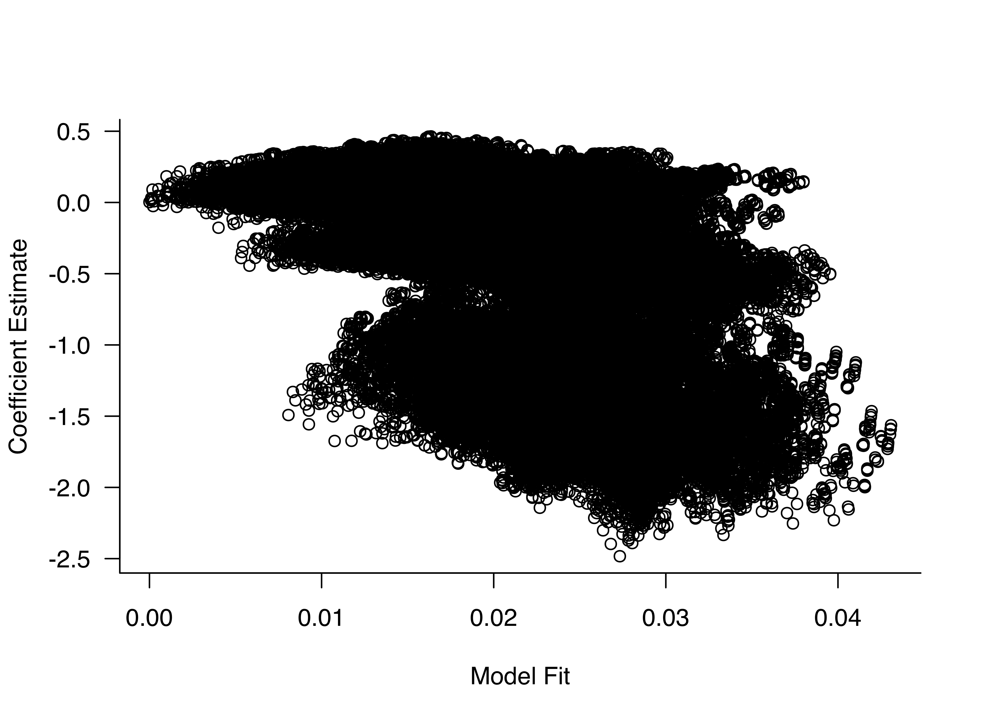
Figure 4: Scatter plot
Code: Hexbin plot
# Read data
DATA <-
  readRDS("/Users/richardtraunmuller/Dropbox/rep_hegsamb/DATA_2.rds")

# Load Packages
library(hexbin) #  To display hexagonally binned data

# Density Encoding
hexbinplot(DATA$Est.z[DATA$variable == "milper"] ~ # Refer to the data
             DATA$dev_diff[DATA$variable == "milper"],
           xlab = "Model Fit", # Label of x-axis
           ylab = "Coefficient Estimate") # Label of y-axis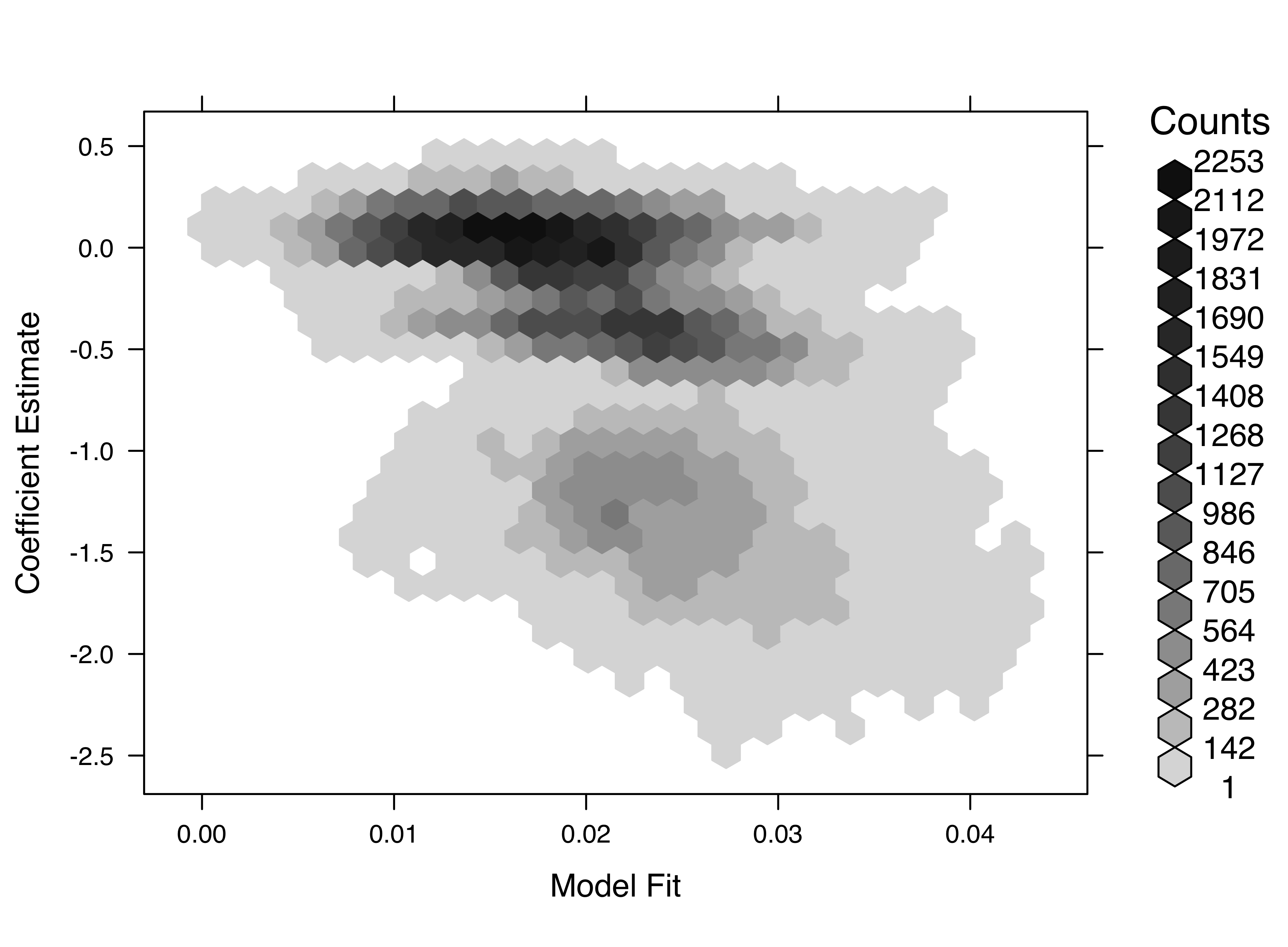
Figure 5: Hexbin plot
The code is based on the full code that can be found in the file “Correlation.R”.
Visualizing contingency tables
Contingency tables (see slide 155/164ff.), or cross tabs, are a neat tool to display relations. It is a table in a matrix format that shows the frequency distribution of variables. However, a standard contingency table is hard to read as we can see here:
Code: Traditional contingency table
# Contingency Table
plot(
  jitter(data$redist),
  # Refer to data
  jitter(data$party.2),
  pch = "",
  # Type of plotting symbol
  cex = .6,
  xlab = "Support for Redistribution",
  # Label of x-axis
  ylab = "",
  # Label of y-axis
  axes = FALSE
  ) # Suppresses both x and y axes
axis(1,
     col = "white",
     col.axis = "black")
axis(2,
     at = c(1:6),
     labels = names(table(data$party)),
     # Defines labels of y-axis
     col = "white",
     col.axis = "black")

for (i in 1:6) {
  text(c(1:5), rep(i, 5), my.tab[i, ])
}
box(bty = "l") # Define box type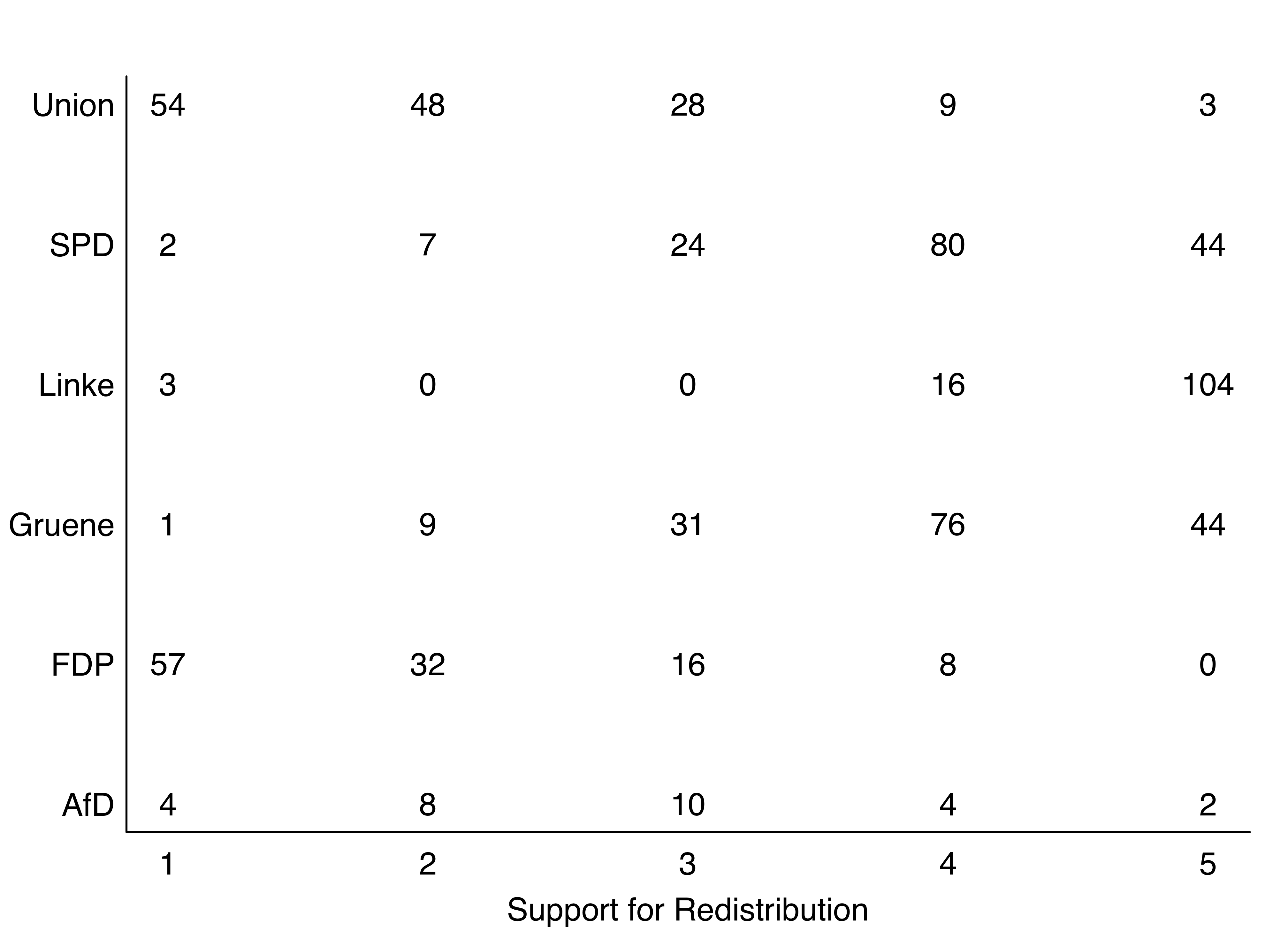
Figure 6: Standard contingency table
One way to plot contingency tables more intuitively, is to relate the absolute numbers to different bubble sizes and colors.
This can be done using the code below. We need to first re-order the levels of the categorical variables logically and then plot bubbles instead of the absolute numbers. In a last step, we add the numbers to generate a more substantive figure.
Code: Advanced contingency table
# Contingency table with colored bubbles
par(mgp = c(1.5, .3, 0))

# Re-order levels of categorical variable (logically)
data$party.ord <- factor(data$party,
                         levels = c("Linke", "Grüne", "SPD", "Union", "FDP", "AfD"))
my.tab <- table(data$party.ord, data$redist) #
rownames(my.tab) <-
  names(table(data$party.ord)) # Add the variable names of "party.ord" as rownames

# Plot
plot(
  0,
  0,
  # Type of plotting symbol
  pch = "",
  # Range of x-axis
  xlim = c(0.5, 5.5),
  # Range of y-axis
  ylim = c(0.5, 6.5),
  # Suppresses both x and y axes
  axes = FALSE,
  # Label of x-axis
  xlab = "Support for Redistribution",
  # Label of y-axis
  ylab = ""
  )

# Write a for-loop that adds the bubbles to the plot
for (i in 1:dim(my.tab)[1]) {
  symbols(
  c(1:dim(my.tab)[2]),
  rep(i, dim(my.tab)[2]),
  circle = sqrt(my.tab[i, ] / 200 / pi),
  add = TRUE,
  inches = FALSE,
  fg = brewer.pal(5, "PRGn"),
  bg = brewer.pal(5, "PRGn")
  )
}
axis(1,
     col = "white",
     col.axis = "black",
     at = c(1:6),
     label = colnames(my.tab))
axis(
  2,
  at = c(1:6),
  label = rownames(my.tab),
  las = 1,
  col.axis = "black",
  col = "white"
  )

# Add numbers to plot
for (i in 1:6) {
  text(c(1:5), rep(i, 5), my.tab[i, ])
}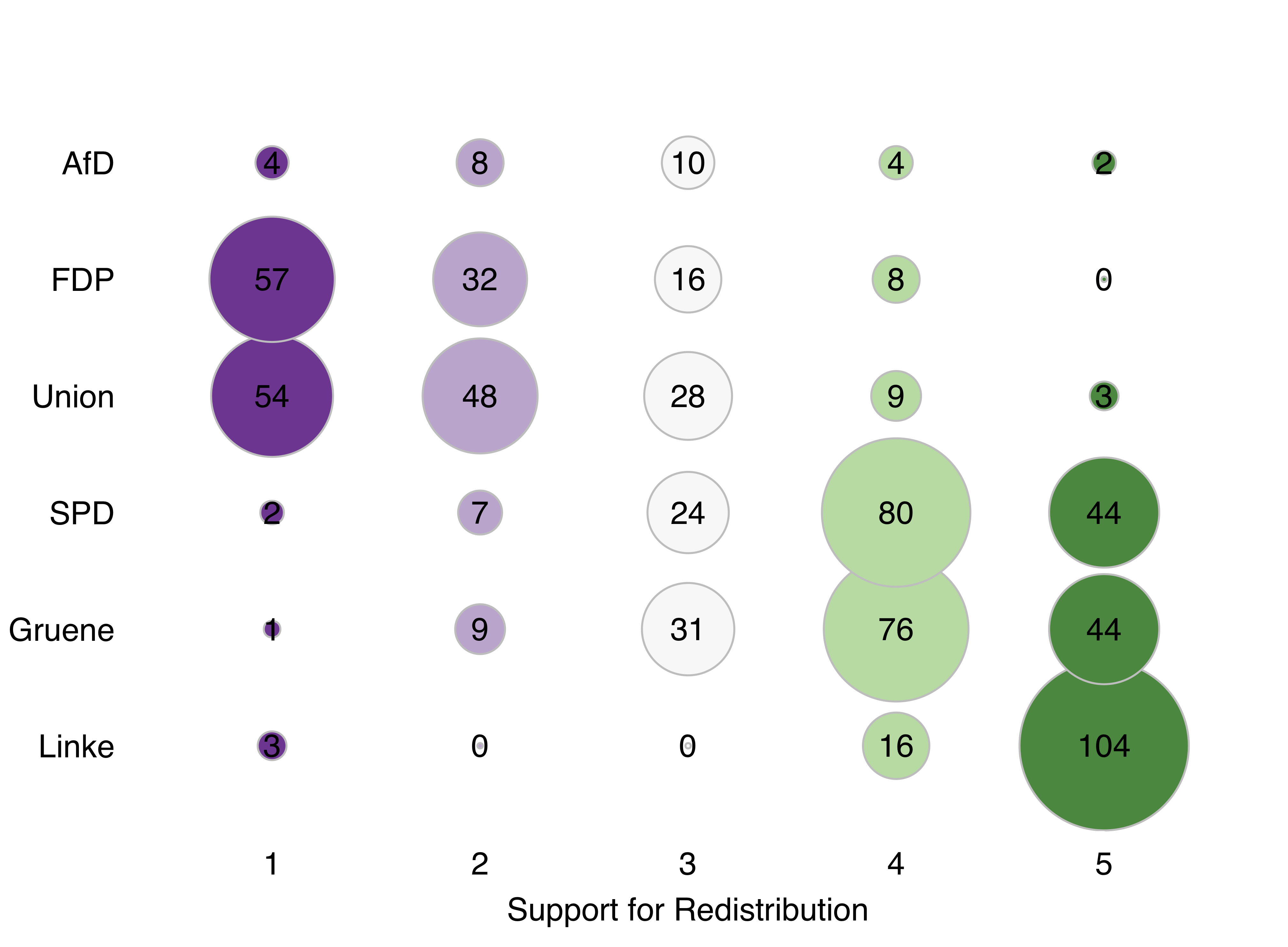
Figure 7: Advanced contingency table
The code is based on the full code that can be found in the file “Multivariate.R”.
Visual inference
One major concern related to exploratory data analysis is the over-interpretation of patterns. Richard provides a line-up protocol (see slide 215) how to best overcome this problem:
1. Identify the question the plot is trying to answer or the pattern it is intended to show. 2. Formulate a null hypothesis (usually this will be \(H_0\): “There is no pattern in the plot.”) 3. Generate a null datasets to visualize (e.g. permutation of variable values, random simulation) 4. Add the true plot to compare the true plot and the null plot(s)
The following example illustrates this procedures:
During the workshop, Richard uses data from the GLES (German Longitdunal Election Survey) as an example to analyze the interviewer selection effects. These biases arise if interviewers selectively contact certain households and fail to reach to others. Reasons might be that researchers try to avoid less comfortable areas.
Following the above-mentioned steps, Richard sets up the following line-up protocol (see slide 218):
1. Identify the question: “Is there a spatial pattern in a map of interviewer contact?” 2. Formulate a null hypothesis: "There is no spatial pattern in interviewer contact behavior: location and behavior are independent. 3. Generate null data sets: Just randomly permute the variable column for contact behavior. 4. Add the true plot: Compare the true plot with the null plots generated in step 3.
In a next step, he translates this protocol into the following code:
# Read data
data <- readRDS("sub_data.rds")

# Code interviewer behavior by color
data$col <-
  ifelse(data$status == "No Contact", "maroon3", "darkolivegreen2")

# Generate random plot placement
placement <- sample((1:20), 20)
layout(matrix(placement, 4, 5))

# Generate 19 null plots
par(mar = c(.01, .01, .01, .01), oma = c(0, 0, 0, 0))
for (i in 1:19) {
  # Randomize the order
  random <- sample(c(1:15591), 15591)
  # Plot
  map(
    database = "worldHires",
    # Refer to dataset
    fill = F,
    col = "darkgrey",
    xlim = c(6, 15),
    # Range of x-axis
    ylim = c(47.3, 55)
    ) # Range of y-axis
  points(
    data$g_lon,
    # Refer to data
    data$g_lat,
    cex = .1,
    pch = 19,
    # Type of plotting symbol
    col = data$col[random]
    )
}

# Add the true plot
map(
  database = "worldHires",
  fill = F,
  col = "darkgrey",
  # Range of x-axis
  xlim = c(6, 15),
  # Range of y-axis
  ylim = c(47.3, 55)
  )
points(
  data$g_lon,
  # Refer to data
  data$g_lat,
  cex = .1,
  pch = 19,
  # Type of plotting symbol
  col = data$col
  )

# Reveal the true plot
box(col = "red", # Draw a box in red
    lty = 2, # Defines line type
    lwd = 2) # Defines line width
which(placement == 20) # Defines the place of the box
Using this code, we receive twenty maps from Germany. Do these plots differ substantially? If yes, can you tell which one is the odd-one-out? Just wait for a few seconds to let the image reveal the answer.
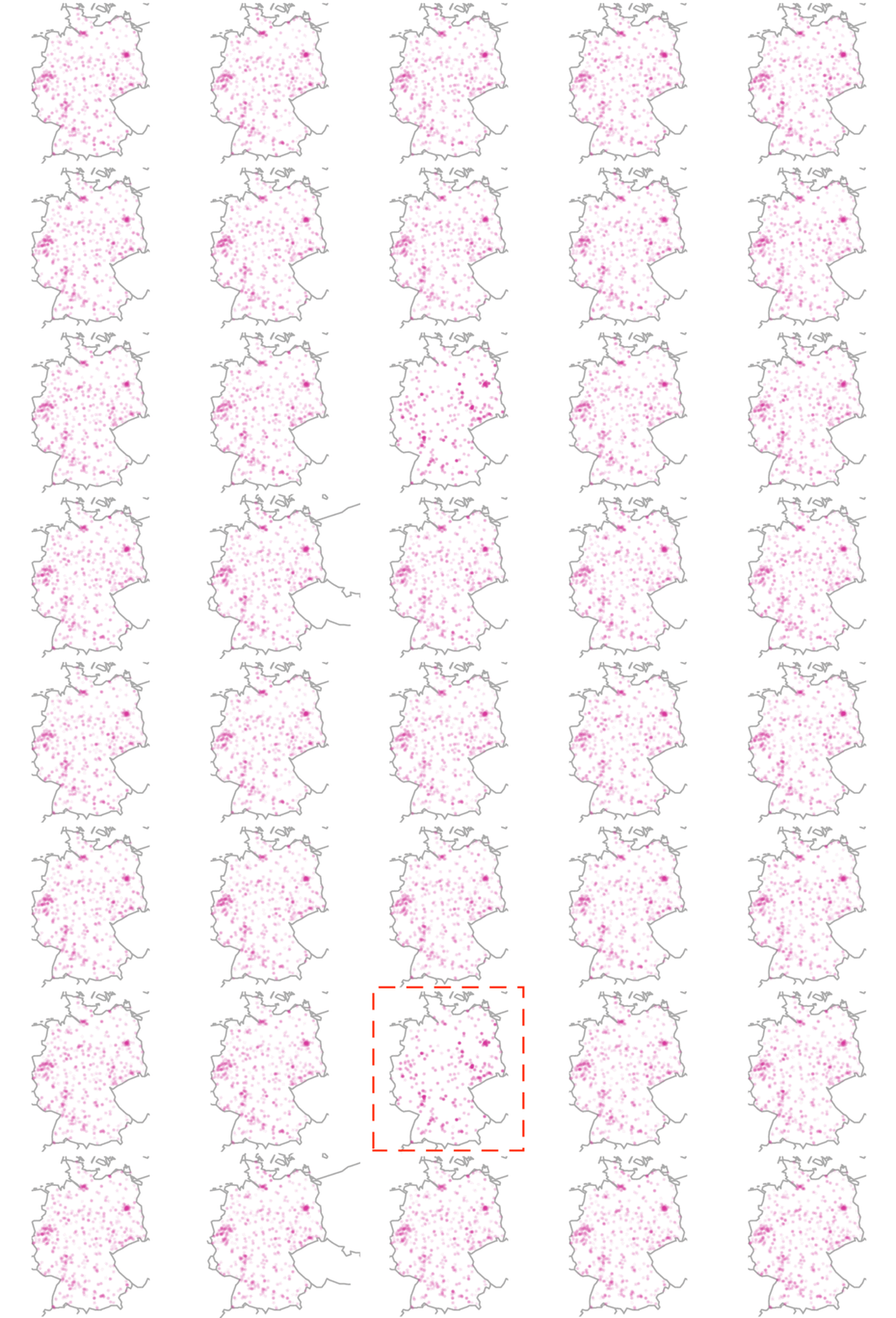
What we do see here is a visual confirmation for a possible interviewer selection bias. This means that the geographical distribution of interviews did not happen randomly but – instead – interviewers could for example have systematically avoided certain areas. You can find a more in-depth blog post on visual inference here.
The code is based on the full code that can be found in the file “Inference.R”.
Presentation of statistical results
In a next step, Richard introduced the workshop’s participants to a convenient way of presenting statistical results. While esimates such as coeffiecients or derived quantities of interest have been traditionally presented in tabular form, a graphical display of coefficients (see slides 229 ff.) or quantities of interest (see slides 233 ff.) is usually more informative and intuitive. These graphical visualizations are particularly essential for displaying results of non-linear models, interaction effects, or models for categorical data.
The following code presents a step-wise guideline how to generate coefficient plots.
This code applies data on police treatments of individuals who were arrested in Toronto for the possession of small quantities of marijuana. The dataset is a built-in dataset in R and can be accessed with the command load(Arrests). The code is part of the lab exercise (see slide 248 f.) and is based on the full code that can be found in the file “Models.R”.
In a first step, we need to load and prepare the data.
# We need to load the required packages
library(arm)
library(effects)

# Load the data
data(Arrests)
data <- Arrests
# You can load the data "Arrests" from R

# Recode variables
data$released <-
  ifelse(data$released == "Yes", 1, 0) # Recode outcome variable
  data$black <-
  ifelse(data$colour == "Black", 1, 0) # Recode independent variable
  data$age.10 <- data$age / 10 # Recode age variable
To visualize how to generate coefficient plots, we refer to the full logistic regression model below:
model_full <- glm(
  released ~  checks + black + employed + age.10,
  data = data,
  family = binomial(link = "logit"),
  x = T
  )
This gives us the well-known results table.
display(model_full, digits = 3)## glm(formula = released ~ checks + black + employed + age.10,
## family = binomial(link = "logit"), data = data, x = T)
## coef.est coef.se
## (Intercept) 1.856 0.150
## checks -0.359 0.026
## black -0.498 0.083
## employedYes 0.778 0.084
## age.10 0.005 0.046
## ---
## n = 5226, k = 5
## residual deviance = 4330.8, null deviance = 4776.3 (difference = 445.5)
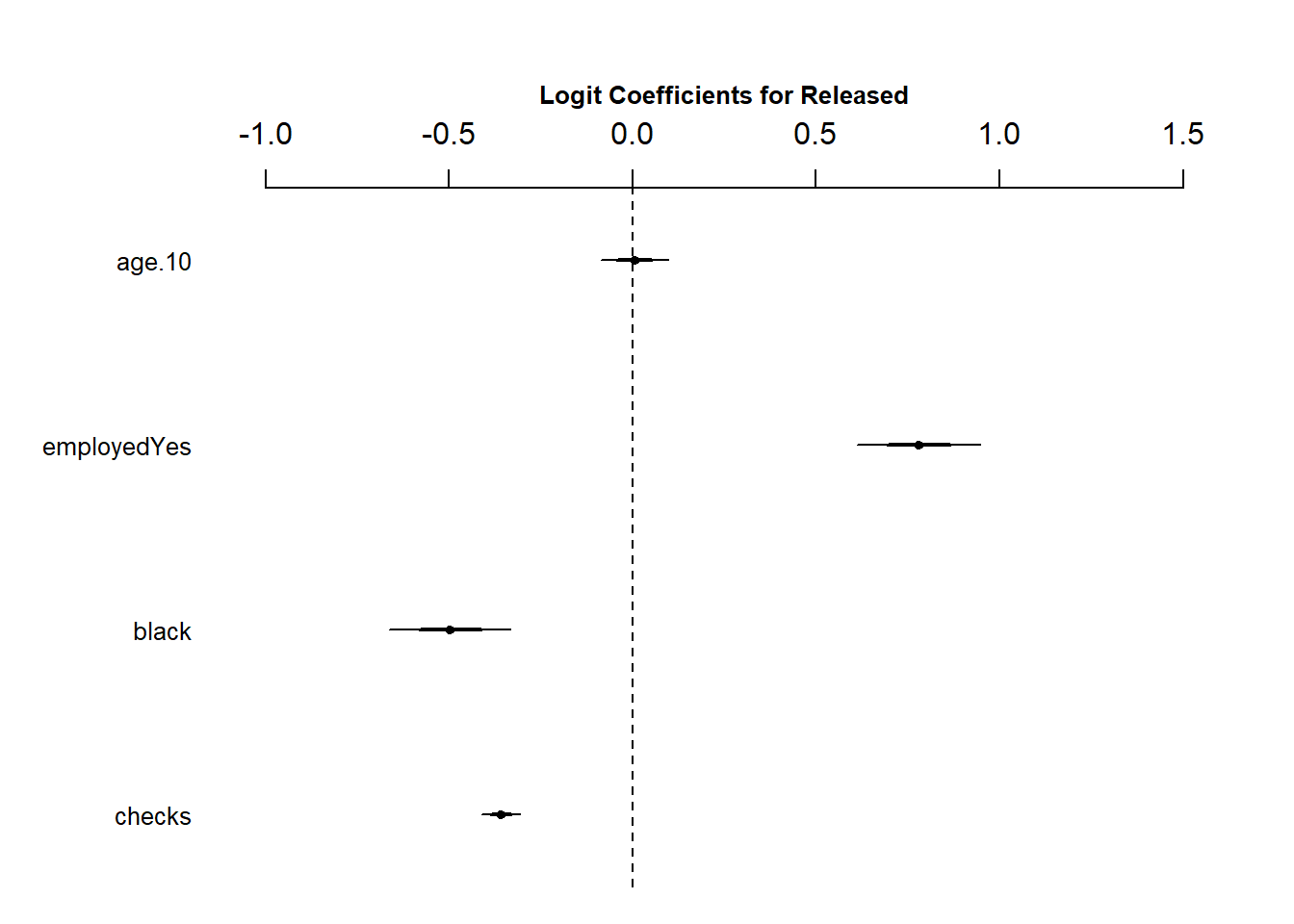
Coefficient plots simply visualize the results of a regression table. To do so, you have two options: You can either rely on pre-programmed functions or code the coefficient plots by hand.
The following code shows how the pre-programmed function coefplot() works:
# Required to give enough space for the full plot
par(mar = c(5, 6, 4, 1) + .1)

# Plot coefficient plot with coefplot()
coefplot(
  # Calls our model
  model_full,
  # Title
  main = "Logit Coefficients for Released",
  # Color of title
  col.main = "black",
  # Scaling of title relative to "cex" (default is 1)
  cex.main = .8,
  # Scaling of axis relative to "cex" (default is 1)
  cex.axis = 0.1,
  # Range of x-axis
  xlim = c(-1, 1.5)
) 
Alternatively, you may want to plot the coefficient plot by hand. You need to extract all relevant information (the coefficient estimates, variable names, and standard errors) first before combining this information to plot the coefficient plot.
# Extract important information

# Extract coefficient estimates
coef.vec <- rev(coef(model_full))
# Extract variable names
names.vec <- rev(names(coef(model_full)))
# Extract standard errors
se.vec <- rev(se.coef(model_full))

# "rev()" reverses the order of the information and
# orders it in the same order as the "coefplot()" function does
You now combine the information and plot the coefficient plot.
The code below combines the information first, adds a zero reference line, and eventually plots confidence intervals based on the standard errors and coefficient estimates.
par(mar = c(5, 6, 4, 1) + .1, las = 1)

# 1. Combine information and plot the cofficient plot.
plot(
  # Plot the coefficient estimates
  coef.vec,
  length(coef.vec):1,
  # Type of plotting symbol
  pch = 17,
  # Scaling of plotting text (relative to the default of 1)
  cex = .8,
  # Suppresses both x and y axes
  axes = FALSE,
  # Label of y-axis (empty)
  ylab = "",
  # Label of x-axis
  xlab = "Logit coefficients",
  # Range of x-axis
  xlim = c(-1, 2)
  )
axis(1)

axis(
  2,
  at = length(coef.vec):1,
  # Plot the variable names
  label = names.vec,
  # Define color of the axis
  col = "white"
  )

# 2. Add zero reference line
abline(v = 0, # Defines position of the line
       lty = 2) # Defines line type

# 3. Add confidence intervals
segments(
  coef.vec - 1.96 * se.vec,
  length(coef.vec):1,
  coef.vec + 1.96 * se.vec,
  length(coef.vec):1
  )
This leads to the following coefficient plot:
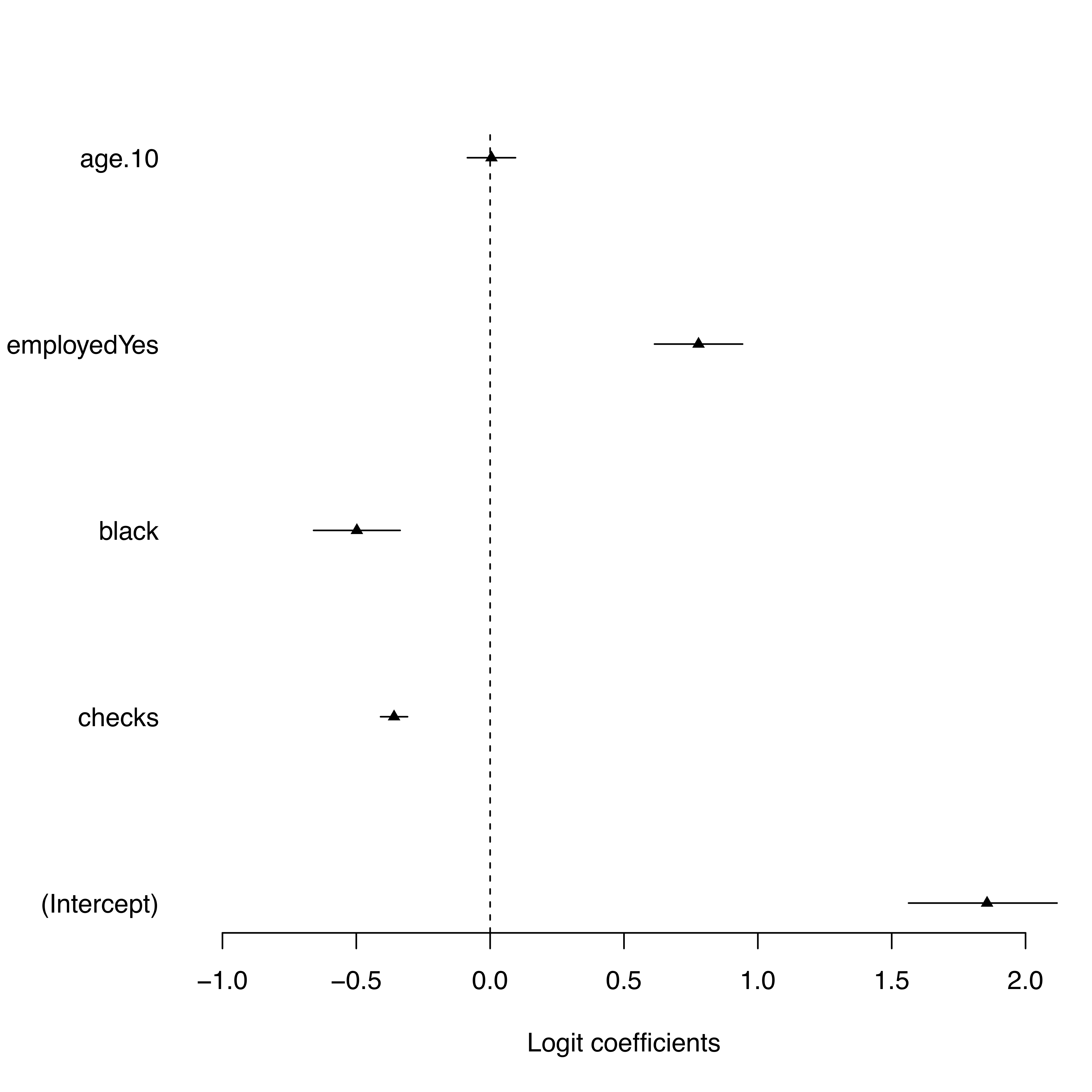
Figure 8: Coefficient plot by hand
A manually written code always allows individual adjustments whereas a pre-programmed function might work well for standard plots but could cause difficulties with more advanced visualizations.
If you further want to derive more substantive results, you should not stop here but proceed and produce quantities of interest. While parameter estimates are the first essential step, quantities of interest allow you to give some meaningful statement of how your outcome changes in different scenarios. Typical quantities of interest are expected values, predicted values, first differences in the expected value, or average treatment effects.
Here, we use group-specific predicted values to compare if the skin color can explain police arrests. In our scenario, we vary the skin color while keeping everything else constant (i.e. the level of employment is “1” and we use average checks as well as average age).
We first generate two scenarios (based on the skin color) and calculate the difference (diff) from these scenarios.
pp.1 <-
  invlogit(cbind(1, mean(data$checks), 1, 1, mean(data$age.10)) %*%
             coef(model_full))
pp.2 <-
  invlogit(cbind(1, mean(data$checks), 0, 1, mean(data$age.)) %*%
             coef(model_full))
diff <- pp.1 - pp.2
In a next step, we write the code to plot the predicted probabilities from these two scenarios and their difference.
# Plot
par(mfrow = c(1, 2), mar = c(3, 3, 2, 0), las = 1)
plot(
  c(1:2),
  c(pp.1, pp.2),
  # Type of plotting symbol
  pch = c(19, 21),
  # Label of y-axis
  ylab = "Predicted Probability",
  # Label of x-axis
  xlab = "",
  # Range of x-axis
  xlim = c(.5, 2.5),
  # Range of y-axis
  ylim = c(0.7, 1),
  # Suppresses both x and y axes
  axes = FALSE
  )
axis(
  1,
  at = c(1:2),
  label = c("Black", "White"),
  col = "white"
  )
axis(2)

par(mar = c(3, 0, 2, 12))
plot(
  1,
  diff,
  pch = c(17),
  ann = F,
  xlim = c(.9, 1.1),
  ylim = c(-.2, .2),
  axes = F,
  col = "maroon3"
  )
rect(-2, -2, 2, 2,
     border = F,
     col = "grey92")
     axis(
     1,
     at = 1,
     label = c("Difference"),
     col.axis = "Maroon3",
     col = "white"
     )
axis(4)
abline(h = 0,
       lty = 2)
points(1,
       diff,
       pch = c(17),
       col = "Maroon3")
This leads to the following visualization:
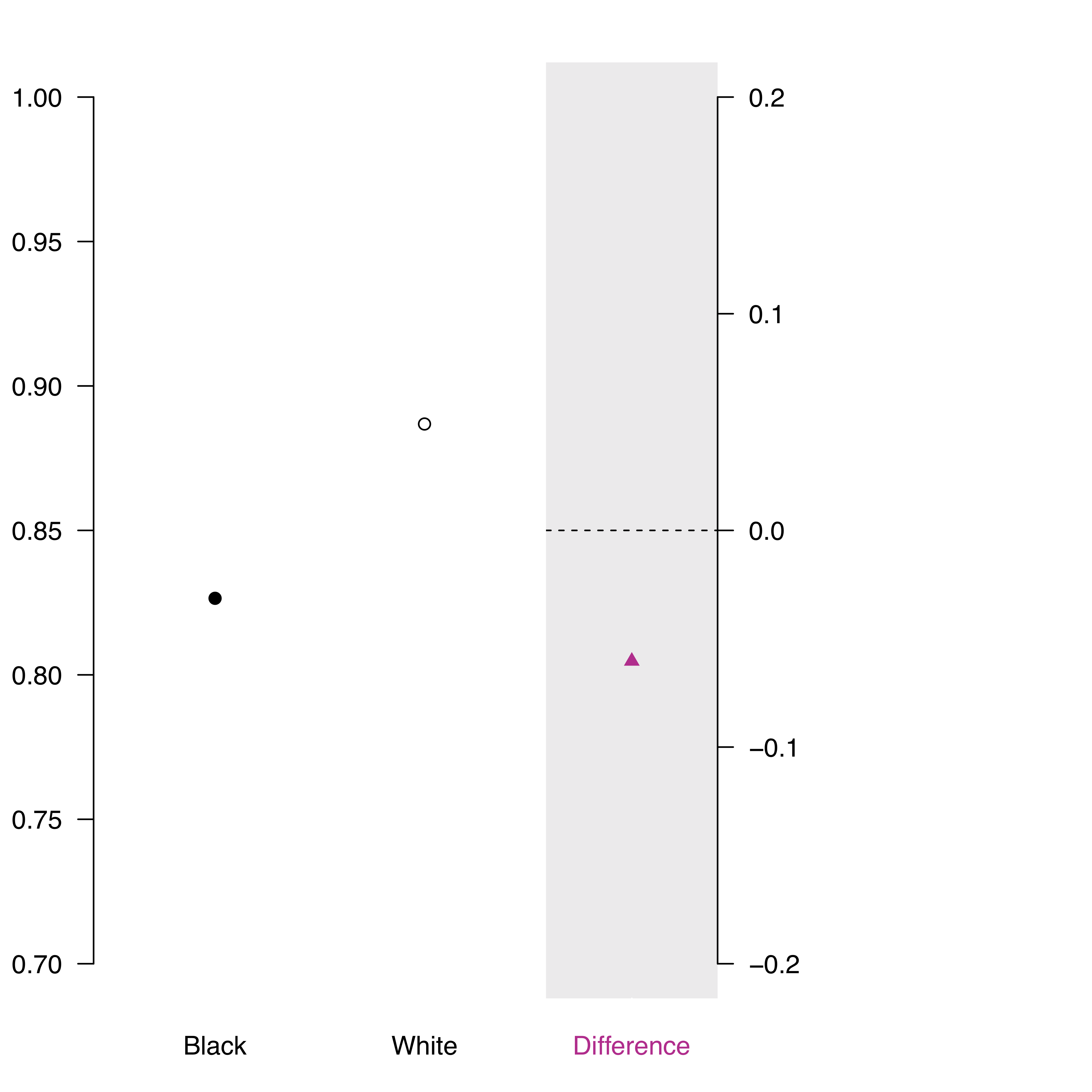
Figure 9: Predicted probabilities
To receive more substantive results, we want to include inferential uncertainty. To do so, we simulate these scenarios 1000 times.
# Let's add inferential uncertainty!
s <- 1000 # number of simulations
s.m.2 <- sim(model_full, s) # simulate the model s times
Based on these simulations, we calculate again the predicted probabilities.
# Again, caculate predicted probabilities
s.pp.1 <-
  invlogit(cbind(1, mean(data$checks), 1, 1, mean(data$age.10)) %*%
             t(coef(s.m.2)))
s.pp.2 <-
  invlogit(cbind(1, mean(data$checks), 0, 1, mean(data$age.10)) %*%
             t(coef(s.m.2)))
s.diff <- s.pp.1 - s.pp.2
Since we simulated, we are now able to also add the uncertainty in form of 95% confidence intervals (you may also change the level of uncertainty if you prefer).
# Let's first look at the uncertainties in terms of 95 % confidence intervals
ci.1 <- quantile(s.pp.1, c(.025, .975))
ci.2 <- quantile(s.pp.2, c(.025, .975))
ci.diff <- quantile(s.diff, c(.025, .975))
Having generated this information, we now combine it to the following code that plots our predicted probabilities with uncertainty levels.
# Now let's add them to the plot
par(mfrow = c(1, 2), mar = c(3, 3, 2, 0), las = 1)
plot(
  c(1:2),
  c(pp.1, pp.2),
  # Type of plotting symbol
  pch = c(19, 21),
  # Label of y-axis
  ylab = "Predicted Probability",
  # Label of x-axis
  xlab = "",
  # Range of x-axis
  xlim = c(.5, 2.5),
  # Range of y-axis
  ylim = c(.7, 1),
  # Suppresses both x and y axes
  axes = FALSE
  )
axis(
  1,
  at = c(1:2),
  label = c("Black", "White"),
  col = "white"
  )
axis(2)

segments(c(1:2), c(ci.1[1], ci.2[1]), c(1:2), c(ci.1[2], ci.2[2]))

# Add 95% Confidence Intervals
par(mar = c(3, 0, 2, 12))
plot(
  1,
  diff,
  pch = c(17),
  ann = F,
  xlim = c(.9, 1.1),
  # Range of x-axis
  ylim = c(-.1, .05),
  # Range of y-axis
  axes = FALSE,
  # Suppresses both x and y axes
  col = "maroon3"
)
rect(-2,-2, 2, 2,
     border = F,
     col = "grey92")
axis(1,
     at = 1,
     label = c("Difference"),
     col.axis = "Maroon3",
     col = "white"
     )
axis(4)
abline(h = 0,
       lty = 2) # Defines line type
points(1,
       diff,
       pch = c(17), # Type of plotting symbol
       col = "Maroon3")

# Add 95% Confidence Intervals
segments(1,
         ci.diff[1],
         1,
         ci.diff[2],
         col = "Maroon3")
This code then generates the following plot that displays the predicted probabilities with uncertainty.
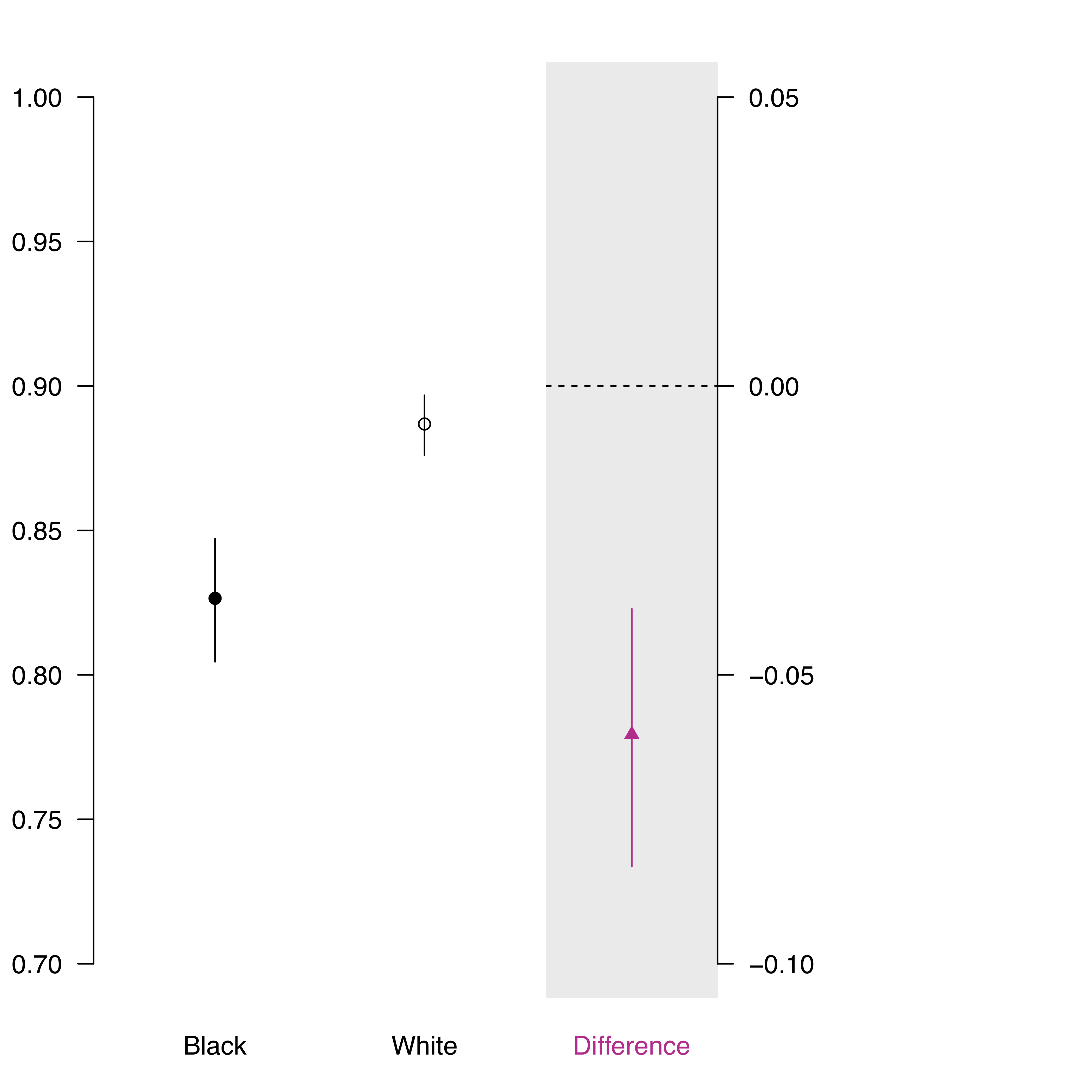
Figure 10: Simulated predicted probabilities
The code is based on the full code that can be found in the file “Correlation.R”.
About the presenter
Richard Traunmüller is a Visiting Associate Professor of Political Science at the University of Mannheim and currently on leave from Goethe University Frankfurt, where he is an Assistant Professor of Empirical Democracy Research. He has a strong interest in Bayesian analysis, data visualization, and survey experiments. He studies challenges that arise from deep-seated societal change: global migration and religious diversity, free speech in the digital age, as well as the legacies of civil war and sexual violence.
