BERT and Explainable AI
Natural language processing (NLP) is a fascinating field. Popular NLP techniques for understanding (written) human language include next-sentence predictions, translations, text classifications, or sentiment analysis. Such techniques already permeate our everyday lives: What would the world be without services such as Google Translate, DeepL, or the recently released ChatGPT? While common bag-of-words approaches can often be a valuable approach for NLP, Google’s release of BERT in 2018 revolutionized the possibilities in NLP. This Methods Bites Tutorial introduces the logic of large language models (LLM) with a special emphasis on BERT. It provides an applied use case from the social sciences, walks readers through explainable artificial intelligence (AI), and explains how we can leverage explainable AI to explain predictions of our models.
While this tutorial targets a broad audience, it requires some basic familiarity with NLP. Here are a few suggestions on how you may want to approach reading this blog post depending on your prior exposure to NLP:
- New to NLP? We encourage you to first read this blog post on data mining, which will familiarize you with the basic concepts in NLP, and then continue with this blog post.
- New to BERT models? We invite you to start reading with the introduction to BERT, where we also present a use case for social science research.
- Already know BERT and up for explainable AI? Go directly to the second part of the blog post, where we cover the basics and dive into explainable AI for BERT.
Throughout the post, we rely on frameworks in Python. While the code of this blog post is heavily Python-focused, you can also use it in R. The package reticulate allows you to run Python code chunks mixing with R. RStudio published a blog post on the essential steps to train your BERT model in R (just as a fun fact: We also wrote this post using reticulate – and it works like a charm!).
If you are more into Jupyter notebooks and leveraging the power of rpy2, you can access our Google Colab sandbox here. If you are new to Python and want to get some basics first, have a look at our Social Science Data Lab sessions on introducing Python (session 1 and session 2). If you want to stick to plain R, there are also (preliminary) package implementations out there such as RBERT.
Overview
BERT
Contrasting BERT and the bag-of-words approach
Bag-of-words models are still a frequently used approach to tackle research questions in social science (Munger et al. 2019; Soroka, Stecula, and Wlezien 2015). While these approaches revolutionized the capability to work with text by converting text into meaningful representations of numbers, there was still no contextual representation involving the position of certain tokens in an input sequence.
Following the scientific concept of standing on the shoulder of giants, the models and concepts following in the years after more traditional bag-of-words approaches – word embeddings, RNN, (bi-directional) LSTM, and attention-based architectures – subsequently improved the understanding of the text and do not stop at the current state-of-the-art: transformers. BERT models belong to the transformer architecture. The word BERT is the acronym for bidirectional encoder representation from transformers.1
While BERT is a transformer-based model, it only makes use of one part of the traditional transformer model architecture. Transformers are typically built upon encoders (that translate the sentence into a vector to make it machine-readable) and decoders (that back-translate the sentence again, possibly to another language). BERT only relies on the encoder part.
Contrasting both the bag-of-words approach and BERT, a major advantage is that BERT comes with a pre-trained language model where you can use your labeled data to fine-tune it. One way of visualizing the difference between both approaches is to think of a student: with bag-of-words, you need to teach the student the language first. With BERT, you have a student who already knows the language but you are teaching the student a specific topic such as biology.
When applying the bag-of-words approach, we train our models based on so-called document-feature matrices in the bag-of-words approach. For this, we use pre-labeled sentences and split them into their single tokens. A token often means a single word in a sentence. We then count how frequently each token occurs in each sentence. Using the analogy drawn above, the model learns (very simply speaking) to relate the number of specific tokens to a specific topic in biology. If a sentence has, for instance, many occurrences of the token “talus” (the Latin term for ankle), it is more likely to belong to anatomy than to neurobiology. The model, however, has neither previous knowledge about the structure of the language nor about biology. It has to learn both concepts in one go and this usually requires a large(r) amount of training data.2
When using BERT models, in contrast, we already have a pre-trained model at hand that we can fine-tune using pre-labeled data. Fine-tuning describes the phase where we give our pre-trained model task-specific labeled data and seek to improve its classification performance. Similar to the bag-of-words approach, it helps here to have a data set at hand that covers your area of interest and where you manually categorized the sentences based on a set of categories. Showing now BERT these texts throughout the fine-tuning phase is a bit different than we know it from bag-of-words. BERT already knows how the sentences are usually structured as well as which words and sentences often go together. To stick to the analogy with biology used before, we can say that the model already took some English classes and acquired the knowledge before going to the biology class. The model (or the student) has already an understanding of the English language but will learn throughout the fine-tuning phase which sentence covers the topics such as anatomy or neurobiology. The model learns based on the labeled examples provided and is then, with good quality and amount of training data, able to apply the newly gained knowledge to unknown sentences.
Setting up a BERT model training pipeline in general is not so much different from the bag-of-words approach. In the training pipeline, you define the steps that you want to follow – such as pre-processing the data by generating tokens and converting the data into a format that the model can work with and eventually training the model. As you can see in the visualization, the steps are quite similar: You load the data, pre-process them, and finally use them to train or fine-tune the model. If you are interested in more details on how the bag-of-words approach can be implemented in R, you have a look at our blog post on text mining.
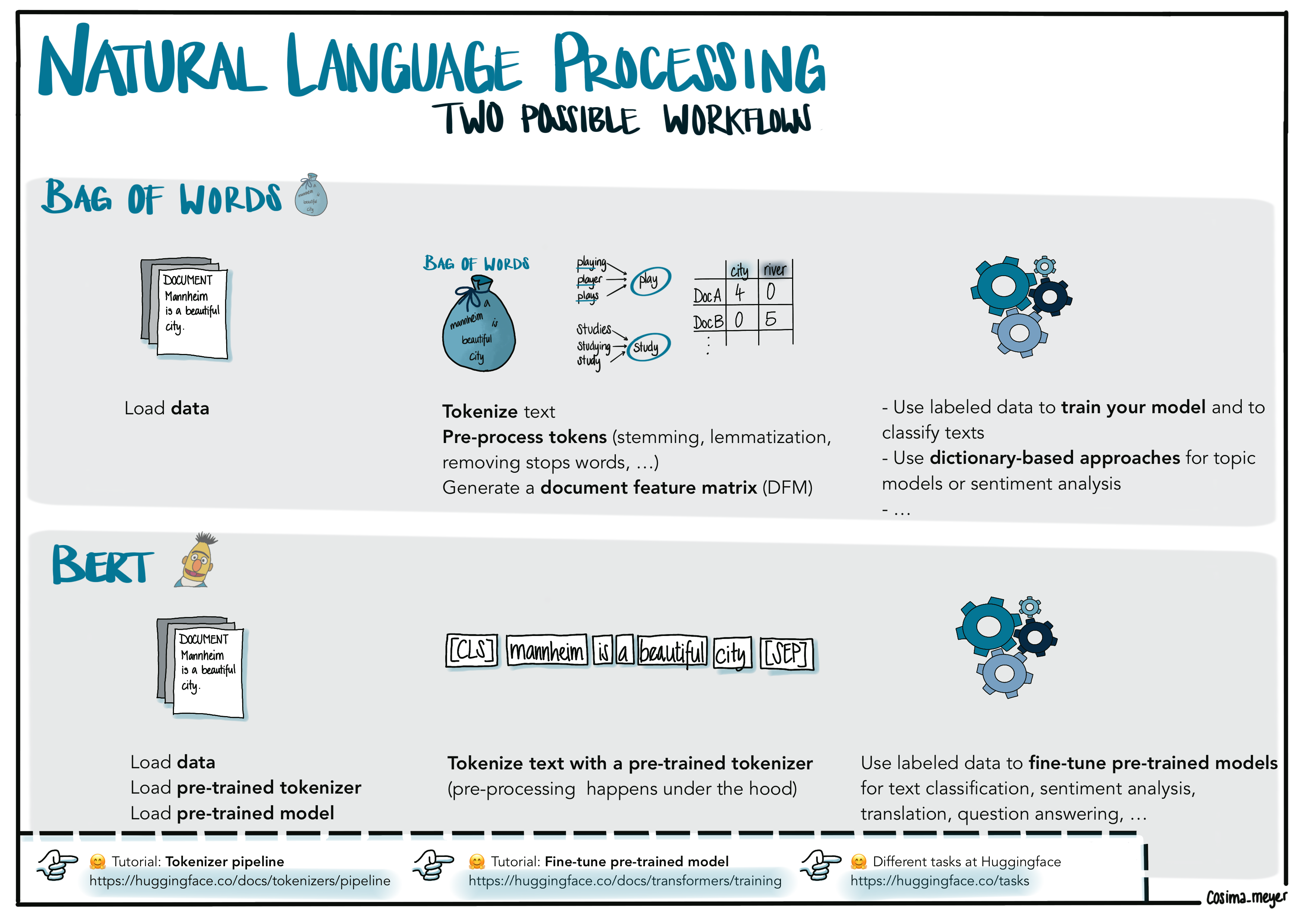
Alternative text
Visualization showing two different workflows (bag-of-words and BERT). The main difference is that with BERT you build upon a pre-trained model and tokenizer while with bag-of-words you often have to train a model from scratch. You can also access the visualization here.
How are BERT models trained?
To understand the advantage of transformer-based models, we explain the terms of both pre-training and fine-tuning in more detail. These two phases split the model training into two parts.
During the pre-training phase, different unsupervised learning tasks are solved on a large amount of textual data to train the model. One of these tasks is called masked language modeling; the other is called next sentence prediction. It is crucial to understand that both of them do not need any prior manual annotation – raw text data is sufficient to train on these tasks. This is what we call unsupervised learning.3 The procedure initializes the model with the specific characteristics (e.g. vocabulary, grammar, and slang) of the input data which makes it especially interesting for text sources that are rather hard to understand. The next task deals with predicting the next sentence. This way, the model learns which sentences usually follow each other.
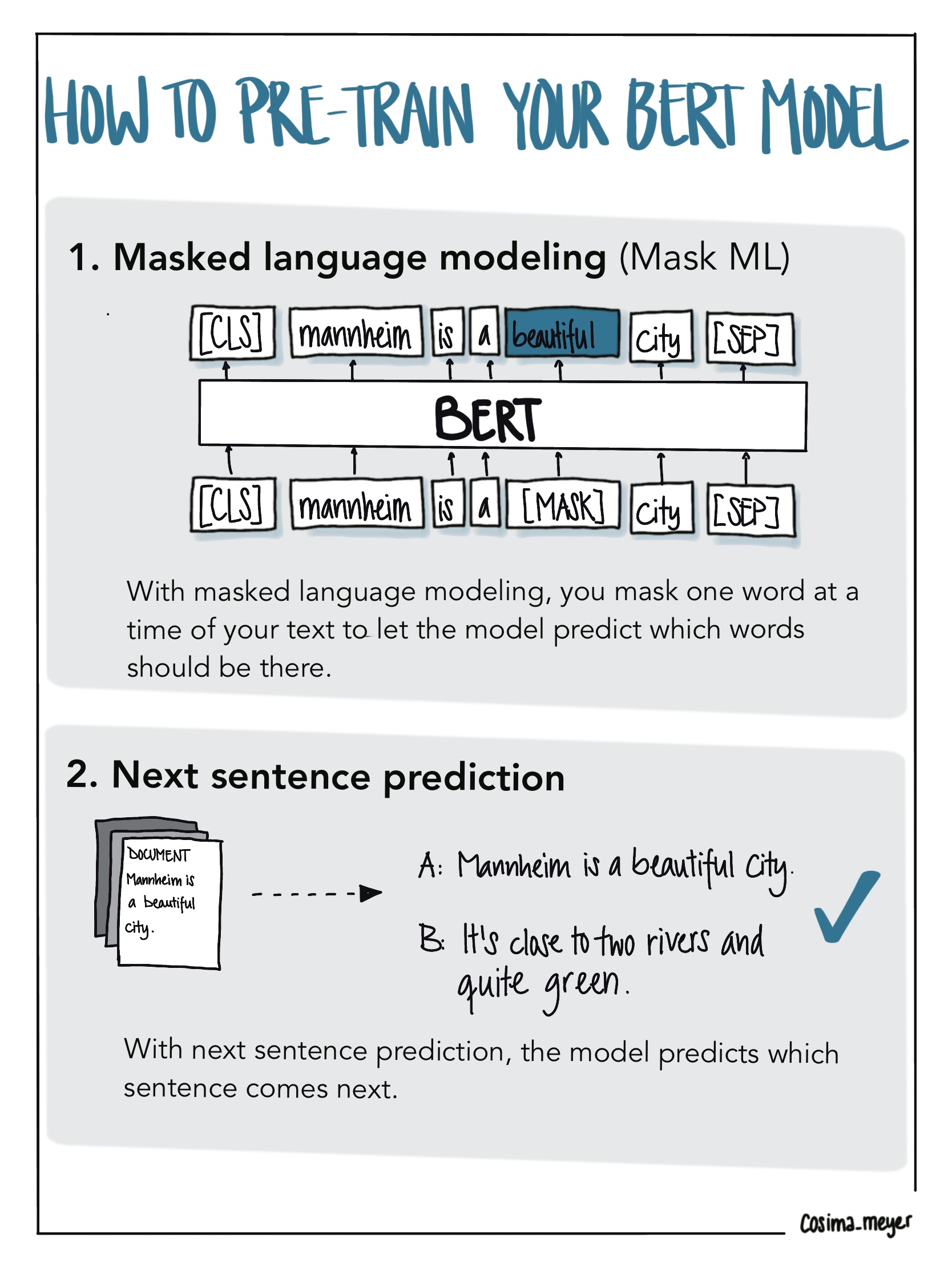
Alternative text
Image showing how BERT models are trained. The first half of the training involves masking the words (Mask ML). During the training period, you mask one word at a time and the model learns, which word usually follows. During the second half, you train the model to predict the next sentence. This way, the model learns which sentences usually follow each other. You can also access the visualization here.
The so-called fine-tuning covers the initialization of the model with the pre-trained parameters as well as the adaption to the task at hand by optimizing these parameters using annotated texts.
How do BERT models “work”?
But how do transformer models and transformer-based models work in detail? As already mentioned, BERT does not process textual tokens in a bag-of-words manner as most common approaches such as Support Vector Machines (SVM), Logistic Regression, or Wordscores do. Although these algorithms provide promising results in some tasks, the position and importance of single words in a textual phrase have only a limited influence on their estimates. As this is especially crucial for texts with a high semantic share (e.g., social media communication), we need a more sophisticated approach for a deeper understanding. Transformer-based models like BERT take into account the contextual representation of every single word dependent on its surroundings (we will provide more information on what this means in the next section).
To do this, transformer(-based) models do neither process a text sequence word by word from left-to-right, or right-to-left nor see it as the bag-of-words approach. They rather use the context from both sides of a word (and read it as a whole at once). This is what makes them bidirectional and allows them to learn the context of a single word based on its surroundings. By doing that, they respect the order of words and additionally build on word embeddings, which can relate semantically similar words with each other.
An important underlying concept is “attention”.4 It is essential for detecting dependencies between elements and therefore capture a context in the input sequence. It adds different weights according to the importance of a single element. This enables one to put more or less emphasis on one or several words in a text and thus helps the model to act more human-like in its decisions. If you want to know more, there is a great video explaining how a BERT model works.
If you want to start coding and applying what you have learned so far, there is a fantastic framework in Python to work with BERT models: 🤗 Huggingface. It has several pre-trained models available on the website including detailed tutorials that are very easy to follow.
Once you understand how BERT works, you can also apply the logic to a variety of text, audio, or video data tasks. For this blog post, we will use text data as an example.
Hands-on: Understanding how BERT embeds text
To understand how a BERT model works, understanding how the model captures text and how it is trained are good starting points.
With BERT, you identify the order of the input. This means that the model first extracts various information on how the text you provide is composed. For this, it uses different layers, which you can also see in the visualization below: token embedding, segment embedding, and position embedding. Using the example phrase “Mannheim is a beautiful city”, you can see how BERT would extract the different layers of information.
With token embedding, BERT captures the single components of your sentence. Tokenization refers to splitting a text into its fragments - usually single words. These fragments are called tokens. As you can see, BERT uses special tokens such as [CLS] and [SEP] to make sense of the input. With segment embedding, the model gets more information about the sentences to which the tokens belong. With position embedding, BERT identifies where each token is placed in the sentence and thus learns the order of the tokens.
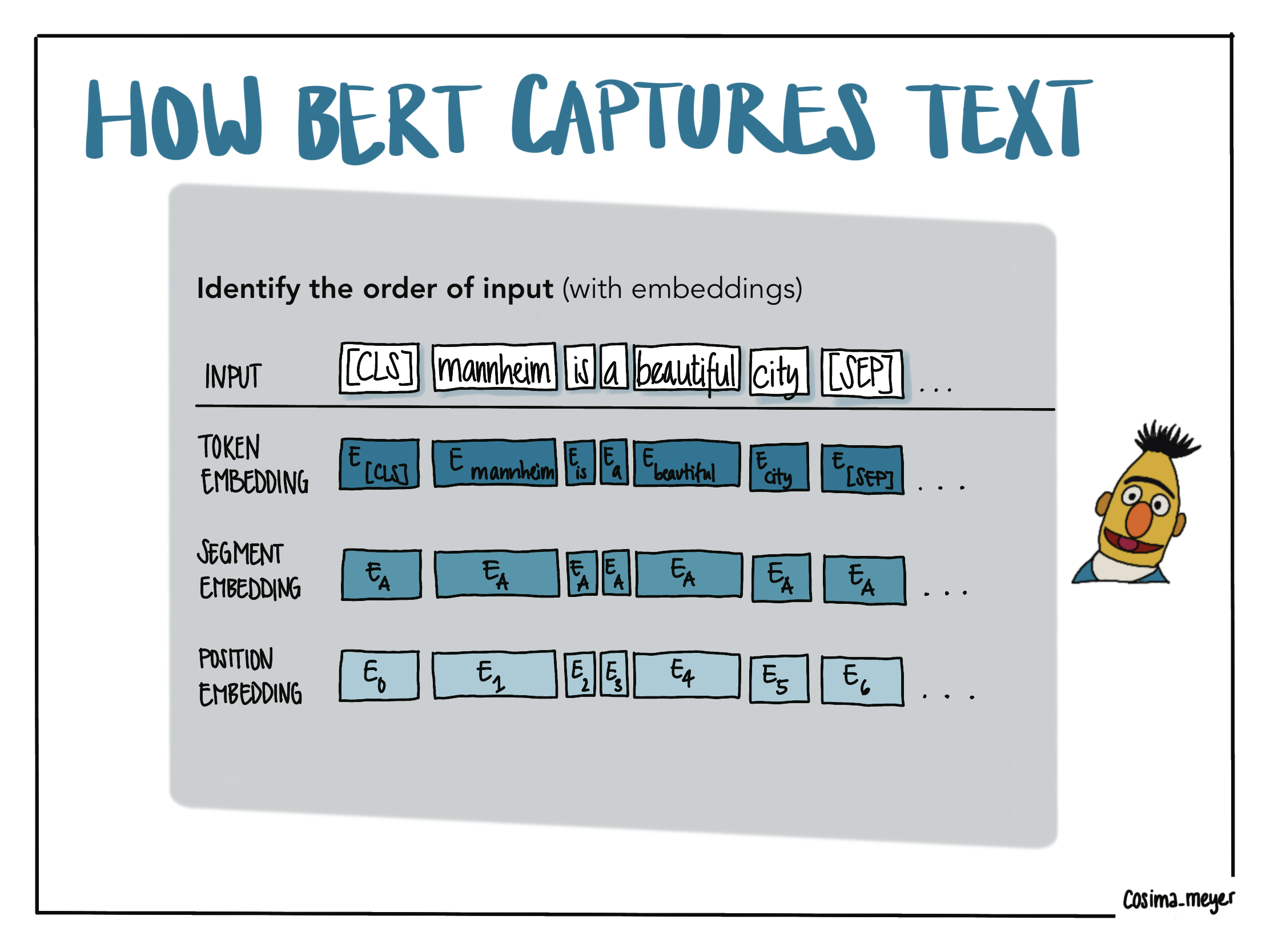
Alternative text
The visualization shows how BERT understands the text. With BERT, you identify the order of the input. You give the model information about different embedding layers (the tokens (BERT uses special tokens ([CLS] and [SEP]) to make sense of the sentence), the positional embedding (where each token is placed in the sentence), and the segment embedding (which gives you more info about the sentences to which the tokens belong). You can also access the visualization here.
To illustrate these concepts, we use a simple example where we encode two sentences (“Mannheim is a beautiful city. It’s close to two rivers and quite green.”) and generate the output. To do this, we first have to import the two modules AutoModelForSequenceClassification and AutoTokenizer from the transformers package (which can be installed using the package manager pip in your terminal).5
pip install transformersTo call the model, we define a model name as it appears on the platform HuggingFace: "distilbert-base-uncased-finetuned-sst-2-english". We will later dive deeper into the particularities of a distilBERT model and will simply apply it for now. The pre-trained model as well as its tokenizer are loaded with the function from_pretrained.
from transformers import AutoModelForSequenceClassification, AutoTokenizer
model_name = "distilbert-base-uncased-finetuned-sst-2-english"
tokenizer = AutoTokenizer.from_pretrained(model_name)
model = AutoModelForSequenceClassification.from_pretrained(model_name)
Once we have successfully set up everything, we can move on to our sentence encoding. We lowercase our sample and feed it into the initialized encoder for tokenization and print the result:
sample = ("Mannheim is a beautiful city. It's close to two rivers and quite green.").lower()
encoding = tokenizer.encode(sample)
print(tokenizer.convert_ids_to_tokens(encoding))
['[CLS]', 'mannheim', 'is', 'a', 'beautiful', 'city', '.', 'it', "'", 's', 'close', 'to', 'two', 'rivers', 'and', 'quite', 'green', '.', '[SEP]']This output shows us how the tokenizer works and how it adds the special tokens to make sense of the input. It is important to note that the pre-trained model also comes with a pre-trained tokenizer. This means that instead of relying on a generic tokenization approach, we can use a tokenizer that is (ideally) a good fit for our data. If we have, for instance, legal texts, a tokenizer trained on legal terminology may be better suitable to get the right tokens out of our text than a tokenizer trained on internet comments.
As computers work better with numbers than words, the plain tokens are just numbers which represent a unique ID that was generated for each token during the process of pre-training. As already outlined above, the pre-training is the phase where you train your initial BERT model. We can see the tokens for our example by looking at our encoding output:
print(encoding)[101, 25116, 2003, 1037, 3376, 2103, 1012, 2009, 1005, 1055, 2485, 2000, 2048, 5485, 1998, 3243, 2665, 1012, 102]Applying BERT to social science data
Throughout this section, we showcase how to apply BERT to social science data. Preparing data for a bag-of-words approach usually requires a bandwidth of pre-processing steps (e.g., stop-word removal or stemming) to prepare the input data. To allow BERT to demonstrate its full capacities, all potential explanatory tokens must remain unaltered. Hence, depending on the pre-trained model, pre-processing only involves lowercasing. However, most tokenizers by default integrate lowercasing as part of their internal routines. Here, we apply this step by hand to show you what the pre-processed tokens look like before evaluation.
As we already know, one can (and has to) choose between many different models trained on different characteristics of data. While this can be overwhelming, the main repository for pre-trained models – 🤗 Huggingface – allows for very specific search queries.
Loading and preprocessing the United Nations General Debate Corpus
In this tutorial, we will work with the United Nations General Debate Corpus (Baturo, Dasandi, and Mikhaylov 2017). It consists of all general debate statements from 1970 (Session 25) to 2020 (Session 75). We store the corpus in a data folder. For demonstration, we will limit it to the last 5 years to predict a sentiment category for each sentence in all speeches using BERT and create a visualization.
To achieve our goal, we include the following steps:
- Loading the speeches and doing some data wrangling
- Setting up and implementing the sentiment prediction pipeline
- Iterate over all sentences to predict their sentiment
- Visualize the results in a plot
If you want to follow the tutorial on your own machine, you can access the data here. If you want to follow the coding examples in a Jupyter notebook, you can access it in this Google Colab sandbox.
As the data comes within various .txt-files and formats differs slightly over the years, we first have to execute some data processing to bring the data into the required shape:
                                     speech_sentence session  year country
0  Let me begin by congratulating Ms. María Ferna...      73  2018     BRB
1  However, I would like to pause at this stage, ...      73  2018     BRB
2  Those events include the transit of a tropical...      73  2018     BRB
3  Those events are of great concern because the ...      73  2018     BRB
4           I ask myself, what does all that matter?      73  2018     BRB
Code for performing the data processing steps
# Load needed packages/functions
import pandas as pd
import glob
import re
import spacy
import os

# Download required spaCy model:
spacy.cli.download("en_core_web_sm")

# Function to transform an input raw speech into a sentence-level data frame
def get_speech_text_from_file(filepath):
    # Load the .txt-file
    with open(filepath) as f:
        lines = f.readlines()

    # Remove numerical identifiers and obsolete whitespaces
    lines = " ".join([re.sub(r'^\d{1,3}(\.|:)(\t| )|\n', '', line) for line in lines])
    # Load spaCy sentencer to split the speech on sentence-level
    nlp = spacy.load('en_core_web_sm')
    doc = nlp(lines)
    sentences = [sent.text.strip() for sent in doc.sents]

    # Create a data frame to store each sentence
    speech_df = pd.DataFrame(sentences, columns = ['speech_sentence'])
    title_search = re.search(r'Session (\d{1,3}) - (\d{4})/(\w{3})', filepath)

    # Add some meta information
    speech_df['session'] = title_search.group(1)
    speech_df['year'] = title_search.group(2)
    speech_df['country'] = title_search.group(3)

    return speech_df

# Data folder path
dir_path = r'./data/'

# List to store files
speeches_df = pd.DataFrame(columns = ['speech_sentence', 'session', 'year', 'country'])

# Identify files in the folder (to loop over relevant once)
folder_in_dir_path = [f.path for f in os.scandir(dir_path) if f.is_dir()]

# Extract the relevant folders
relevant_folders = []

for folder in folder_in_dir_path:
  # Extract the year (it comes with four digits) from the folder name
  year = int(''.join((str(i)) for i in re.findall('[0-9]{4}', folder)))
  # Identify the folder names of the last 5 years
  if year>2015:
    relevant_folders.append(folder)

# Iterate over the directory with relevant folders and crawl files
for folder in relevant_folders:
  for filename in glob.iglob(folder + '/**/*.txt', recursive=True):
    # Call function to transform an input raw speech into a sentence-level data frame
    speech_df = get_speech_text_from_file(filename)
    # Concatenate all resulting data frames into one
    speeches_df = pd.concat([speeches_df, speech_df], ignore_index=True)

speeches_df.head()
speech_sentence session year country
0 Let me begin by congratulating Ms. María Ferna... 73 2018 BRB
1 However, I would like to pause at this stage, ... 73 2018 BRB
2 Those events include the transit of a tropical... 73 2018 BRB
3 Those events are of great concern because the ... 73 2018 BRB
4 I ask myself, what does all that matter? 73 2018 BRBIf you are working on a Unix(-like) OS system, you may need to call these commands in your terminal first (whether it’s pip or pip3 as well as python or python3 depends on your version):
pip install -U spacy
python3 -m spacy download en_core_web_sm
Setting up and implementing the sentiment prediction pipeline
Now we have some neatly processed and organized speeches and want to continue with the exciting part: extracting sentiment using BERT and explaining its decisions with a framework. This leads us to an essential question: what is the right model for the data and task?
A good starting point can be the number of downloads of a model and also a well-documented model card. However, there are a few very decisive properties to narrow down the search:
- Tasks – What is the underlying task the model is trained on (e.g., text classification or automatic speech recognition)?
- Language(s) – Do the pre-trained models speak the same (or a related) language as the data in my dataset?
- Size – Larger models tend to require more computational power, but also also trained on more data, which is beneficial in some cases.
- Source – Who trained the initial model? Given that these models come in with “prior knowledge”, you usually want to reduce the risk of biases as much as you can. While the selection of the initial training data can give a (first) good hint, using models that are well documented and come from reliable sources (although it can be up for debate how to define this) can be additional selection criteria.
BERT is among the most popular transformer-based model. Its architecture is based on twelve of the so-called encoder blocks (as described in the initial BERT paper by Devlin et al. (2018)). As we would like to reduce the computational workload to make this tutorial accessible for everyone, we decided to further work with a distilBERT model: distilbert-base-uncased-finetuned-sst-2-english. These models are smaller and faster than BERT-based models. The first distilBERT model was 40% smaller and 60% faster than a base BERT model while retaining about 97% of its functionality (Sanh et al. 2019).6
Using this model, we first start with our sentiment prediction pipeline. This is usually done by loading an appropriate model and then initializing the tokenizer:
from transformers import AutoModelForSequenceClassification, AutoTokenizer
from transformers_interpret import SequenceClassificationExplainer

model_name = 'distilbert-base-uncased-finetuned-sst-2-english'
model = AutoModelForSequenceClassification.from_pretrained(model_name)
tokenizer = AutoTokenizer.from_pretrained(model_name)
These are also typical steps you need to do when fine-tuning a BERT model. We skip the fine-tuning step here because we do not have pre-labeled training and test data at hand. This also means that we cannot calculate the common metrics to understand the quality of our fine-tuned models. But with our pre-trained model at hand (we use the distilbert-base-uncased-finetuned-sst-2-english), we already have a model that has a good understanding of sentiment in the English language.
For this tutorial, we directly apply the existing knowledge of the model to our text corpus. In the following code chunk, we iterate over all sentences using the Python function apply() to call the custom function predict_sentiment() for each sentence. predict_sentiment() is a function that generalizes the pipeline we already implemented for our toy example in the first part of this blog post. The function takes the sentence and applies tokenization to convert it into a machine-readable format. The so-called inputs are then fed into our pre-trained BERT model to predict. argmax() helps us to find the sentiment class which is assigned with the highest probability according to the prediction. After converting the class ID to its label (either “positive”, “neutral”, or “negative”), we write its result back to a new column called sentiment:
def predict_sentiment(sequence):
  # Apply tokenization on our input sentence
  inputs = tokenizer(sequence, return_tensors='pt')
  # Do the prediction and save the logits
  logits = model(**inputs).logits
  # Find the class (Positive, Neutral, or Negative) which has the highest probability
  predicted_class_id = logits.argmax().item()
  # Return the predicted class
  return(model.config.id2label[predicted_class_id])

# Call predict_sentiment for all sentences
speeches_df['sentiment'] = speeches_df['speech_sentence'].apply(lambda speech_sentence: predict_sentiment(speech_sentence))
# The lambda function used here is a Pythonic approach to write an anonymous function
# and it can take any number of arguments.
We now have the sentiment on the sentence level and we want to visualize some aspects of it. Since we use {reticulate}, it is fairly easy to switch between the worlds of Python and R. In our case, R seems to be a better candidate for visualization (if you love the logic of {ggplot2}. If you want to stay in Python, you can also give {plotnine} a try).
Code for generating the visualization
# Install pacman (package manager) if not done already
# install.packages(pacman)

# Load the tidyverse package via the pacman package manager
pacman::p_load(tidyverse,
               reticulate,
               countrycode)

# Get speeches from Python and transfer them into the R Environment
speeches_df <- py$speeches_df %>%
  # Convert categorical names to sentiment numbers
  dplyr::mutate(
    sentiment = dplyr::case_when(
      sentiment == "NEGATIVE" ~ -1,
      sentiment == "NEUTRAL" ~ 0,
      sentiment == "POSITIVE" ~ 1
    )
  ) %>%
  # group by country and year and calculate net sentiment values by summing them
  dplyr::group_by(country, year) %>%
  dplyr::summarise(net_perc = sum(sentiment))

speeches_df %>%
  # Generate the country name for each country using the
  # `countrycode()` command
  dplyr::mutate(countryname = countrycode(country, "iso3c", "country.name")) %>%
  # Filter and only select specific countries that we want to compare
  dplyr::filter(
    countryname %in% c(
      "North Korea",
      "Germany",
      "United Kingdom",
      "United States",
      "Pakistan",
      "France"
    )
  ) %>%
  # Now comes the plotting part :-)
  ggplot() +
  # We do a bar plot that has the years on the x-axis and the level of the
  # net-sentiment on the y-axis
  # We also color it so that all the net sentiments greater than 0 get a
  # different color
  geom_col(aes(
    x = year,
    y = net_perc,
    fill = (net_perc > 0)
  )) +
  # Here we define the colors as well as the labels and title of the legend
  scale_fill_manual(
    name = "Sentiment",
    labels = c("Negative", "Positive"),
    values = c("#C93312", "#446455")
  ) +
  # Now we add the axes labels
  xlab("Time") +
  ylab("Net sentiment") +
  # And do a facet_wrap by country to get a more meaningful visualization
  facet_wrap( ~ countryname) +
  # And make the theme a bit more beautiful
  theme_minimal() + theme(
    strip.background = element_blank(),
    panel.grid.major = element_blank(),
    panel.grid.minor = element_blank()
  )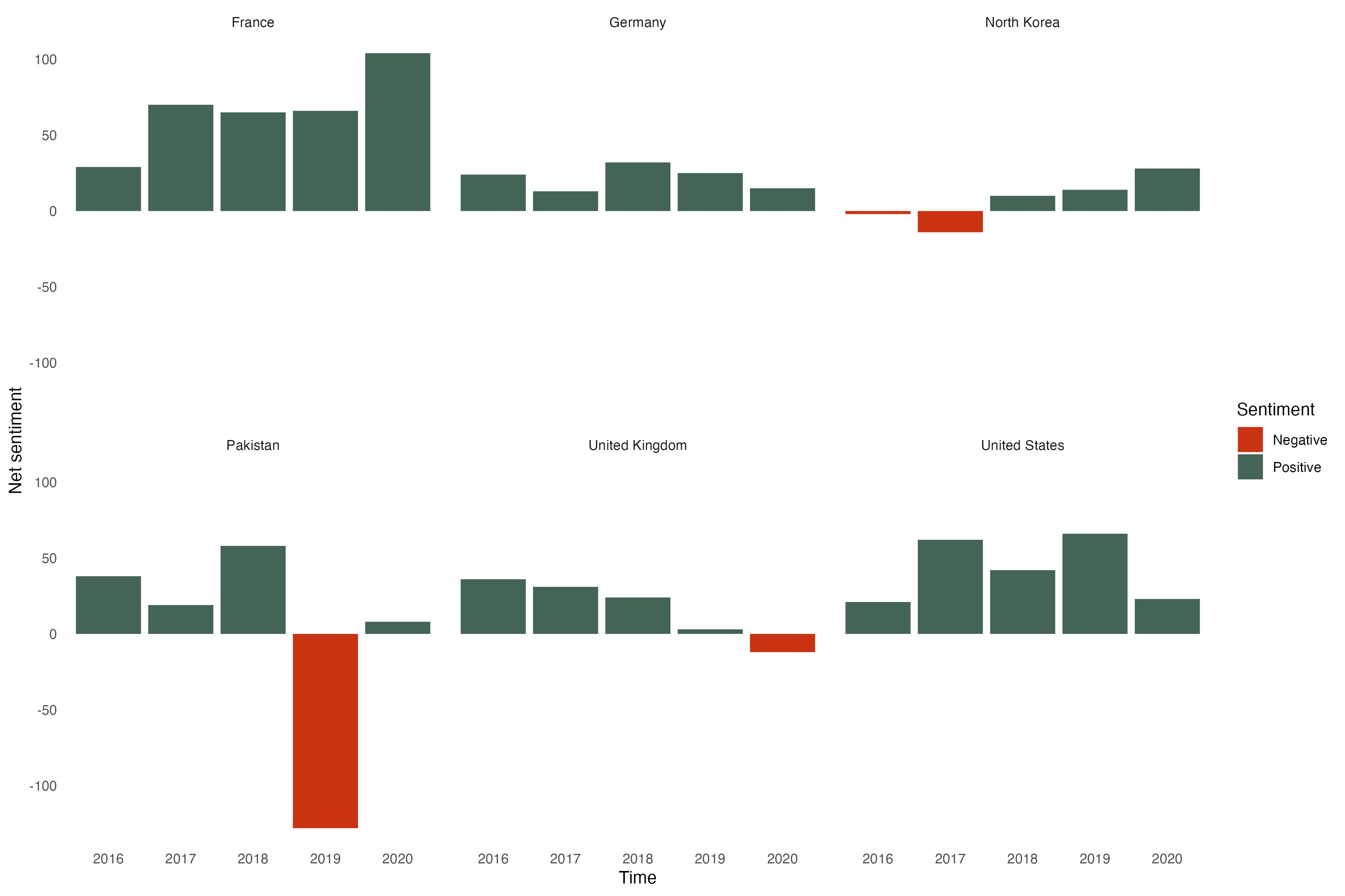
Alternative text
The visualization shows the net sentiment in the UN General Assembly speeches of six countries (France, Germany, North Korea, Pakistan, the United Kingdom, and the United States) from 2016-2020. Using color-coded bar graphs we see that France, Germany, and the US are overall positive while the other countries tend to express more negative net sentiments in their speeches.
Having an understanding of the net sentiment of speeches is a good start. But what we really want is to understand why the model classifies the sentences this way. That is where explainable AI comes in.
Explainable AI
Background of explainable AI
Machine learning models are often thought of as “black boxes” where we put in some input and get results out of them without a good understanding of how these models come to a given classification or prediction. This is what explainable AI seeks to change. Explainable (or interpretable) AI is thought of as one core pillar that contributes towards trustworthy AI (which often also includes other aspects, such as ethical AI or fair ML). With more and more AI models being used, it is not surprising that we see an increase in interest in these topics (Liu et al. 2022; Markus, Kors, and Rijnbeek 2021; Prasad et al. 2020; Romei, Ruggieri, and Turini 2012; Wickramasinghe et al. 2020; Yang, Ye, and Xia 2022).
Visualizations are often helpful to better understand machine learning models. Some visualization approaches are model-specific (for instance tree SHAP for tree-based models), but some are more model-agnostic (for instance, Shapley values, LIME, or ICE plots). The visualization below gives you a brief overview of some of the more well-known approaches. If you are looking for more in-depth explanations, have a look at the book “Interpretable Machine Learning” by Christoph Molnar.
The examples used in the visualization present toy examples which are only meant to showcase how explainable AI can be used to understand what drives the model prediction. Here, the primary question is what defines a livable city. We can see how (artificial) features such as the number of restaurants or whether there are industries, parks, or cafés can contribute to a city being classified as “livable”.
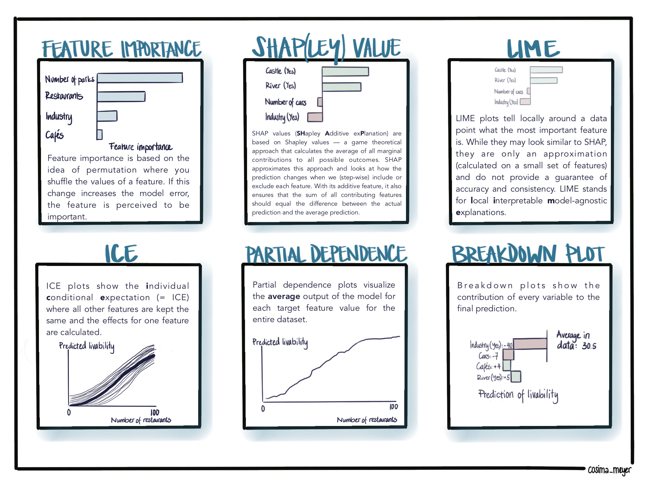
Alternative text
The visualization of six different model-agnostic approaches to explain machine learning models post-hoc such as
- Feature importance: Feature importance is based on the idea of permutation where you shuffle the values of a feature. If this change increases the model error, the feature is perceived to be important. Shapley and SHAP value: SHAP values (SHapley Additive exPlanation) are based on Shapley values — a game theoretical approach that calculates the average of all marginal contributions to all possible outcomes. SHAP approximates this approach and looks at how the prediction changes when we (step-wise) include or exclude each feature. With its additive feature, it also ensures that the sum of all contributing features should equal the difference between the actual prediction and the average prediction.
- LIME: LIME plots tell you locally around a data point what the most important feature is. While they may look similar to SHAP, they are only an approximation (calculated on a small set of features and do not provide a guarantee of accuracy and consistency).
- ICE: ICE plots show the individual conditional expectation where all other features are kept the same and the effects for one feature are calculated.
- Partial dependence: Partial dependence plots visualize the average output of the model for each target feature value for the entire dataset.
- Breakdown plot: Breakdown plots show the contribution of every variable to the final prediction.
You can also access the visualization here.
Explainable AI for BERT
To better understand (and explain) the outcome of BERT models, the Python library Transformers Interpret is an excellent starting point and offers post-hoc explainability. Post-hoc means that you use Transformers Interpret on your classification results. It gives you a good understanding of which word was more likely to contribute to the classified sentiment. But before we get into it, we will explain how Transformers Interpret generally works.7
How does “Transformers Interpret” work?
Transformers Interpret builds upon the Captum framework, an explainable AI framework for PyTorch-based models. PyTorch is a common open-source machine learning framework in Python that can be used to build deep learning models.8 If you are looking for other model types (and want to go beyond text data), have a look at their tutorials.9
Captum was developed by Facebook AI and presented at the PyTorch 2019 Conference. It is a framework that is multi-modal and can be used for any PyTorch-based model, it is extensible and grows over the years with extensions such as Transformers Interpret. Additionally, and for the user probably most important, it is easy to use. To run a post-hoc explanation of a BERT model, you are good to go with only a few lines of code. Captum itself has a multitude of attribution algorithms that are used to explain what the model does. The library Transformers Interpret uses the idea of Integrated Gradients (as well as Layer Integrated Gradients which is a variant of it; see Janizek, Sturmfels, and Lee (2021) and Sundararajan, Taly, and Yan (2017)).10
Simply speaking, the logic of integrated gradients is as follows:
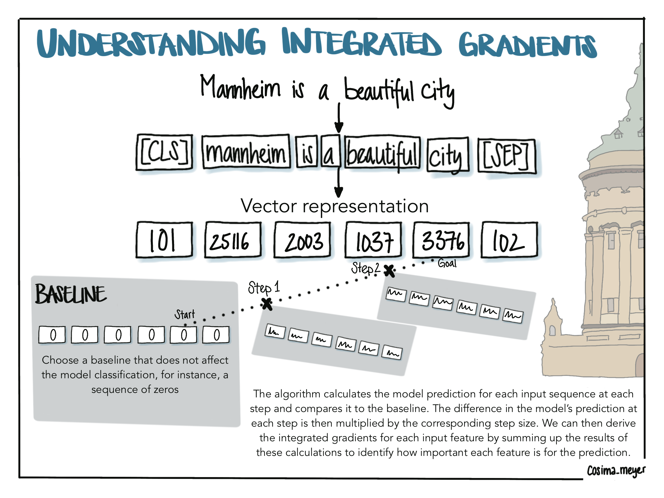
Alternative text
The visualization shows the logic of integrated gradients. You start with your baseline which does not have any effect on the model classification and continue stepwise using linear interpolation to get to the original input. On the way, you calculate the model’s prediction, compare it to the baseline, and derive the integrated gradients for each input feature by summing up the results of these calculations.
We start again with our input “Mannheim is a beautiful city” and convert it into a vector representation.11 We then define a baseline that does not have any effect on the model classification. For text data, this can be a sequence of zeros (Sundararajan, Taly, and Yan 2017). Following the approach by Sundararajan, Taly, and Yan (2017), which introduced the concept of integrated gradients as a method for explainable AI, the algorithm now takes a pre-specified number of steps along a so-called linear interpolation. You can think of it as a line with points on it. Going along this line, we then pick the points on your steps and add them to your initial sequence. This procedure works because for BERT words are not represented as words but as a sequence of numbers (that’s also what we call a vector representation of words). The algorithm calculates the model prediction at each step and compares it to the baseline. The difference in the model’s prediction at each step is then multiplied by the corresponding step size. In the last step, we derive the integrated gradients for each input feature by summing up the results of these calculations. This way, we eventually end up with a sum that indicates how important each input feature is to the prediction (this is also called “attribution score”).12
Using integrated gradients can be powerful, and what’s best is that their power is not limited to text data but can also be applied to images and even used for structured data. Most of the explanations you will find online use image data as an example.13
Now that we covered a basic understanding of how to explain the model’s behavior, we go back to our hands-on use case. But before we see how these algorithms work in practice, we do the logistics and install the required libraries in your terminal.
pip install transformers-interpretAgain, depending on your pip version, you might need to call pip or pip3 to install the dependencies.
from transformers_interpret import SequenceClassificationExplainerWith the SequenceClassificationExplainer method, we are now able to explain a sequence classification task such as sentiment classification. It takes both the previously defined model and tokenizer to compute the attributions. Attributions are numeric values that show how positively or negatively a word contributes to the classification. Here, we refer to the previously used model and tokenizer.
cls_explainer = SequenceClassificationExplainer(model, tokenizer)Let us first select a sample of five sentences from speeches delivered by a sub-sample of countries:
# Extract five random sentences based on a pre-selection
random_sentences = speeches_df[speeches_df.country.isin(['USA','FRA','GER'])].sample(n=5,random_state=1234)['speech_sentence'].reset_index(drop=True)

# Print each sentence in its full length
for sentence in range(len(random_sentences)):
  print(random_sentences[sentence])
Around the world our message is clear — America's goal is lasting harmony, and not to go on with these endless wars.
Behind every one of our decisions are the voices and lives of the invisible masses whom we must defend, because we in turn were defended in the past.
That wealth, which rightly belongs to Iran's people, also goes to shore up Bashar Al-Assad's dictatorship, fuel Yemen's civil war and undermine peace throughout the entire Middle East.
Everyone is tempted to follow their own law.
Here too we will remain fully committed.Using Transformers Interpret on a single sentence
These sentences sound quite diverse – some more positive, some more negative. Let’s check if that is also what the model classified. Using the method cls_explainer, we also generate an object word_attributions that will be helpful later. We use the first sentence as a working example: Around the world our message is clear — America's goal is lasting harmony, and not to go on with these endless wars.
word_attributions = cls_explainer(random_sentences[0])With our cls_explainer object, we can look at the predicted class:
cls_explainer.predicted_class_name'POSITIVE'And it tells us that the classification is “positive”! But what we are really interested in is which words were important for this classification. This is what you get by calling visualize():
cls_explainer.visualize()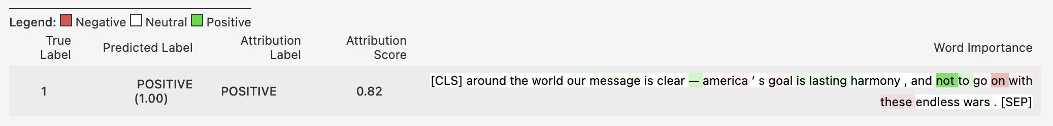
Alternative text
The visualization shows the output of the visualize() method. We see in this visualization the predicted label, the attribution label, the overall attribution score, and, most importantly a visual component on the right-hand side. Red highlighted parts contribute negatively to the classification while green highlighted parts contribute positively and white (so no highlight) are considered neutral (or no contribution).
What we see in this visualization are the predicted label (1), the attribution label (“POSITIVE”), the overall attribution score (0.82, where the magnitude indicates the strength of the contribution), and, most importantly, a visual component on the right-hand side. Red highlighted parts contribute negatively to the classification while green highlighted parts contribute positively and white is considered neutral (or no contribution). The saturation shows the magnitude of the contribution. The visualization also matches with the numeric attributions and shows how positively, negatively, or neutrally a word (feature) contributes to the classification. As mentioned earlier, we can also get them by printing our previously generated word_attributions.
print(word_attributions)[('[CLS]', 0.0),
('around', 0.027562093028343622),
('the', 0.026963912669903427),
('world', 0.007187272390974884),
('our', 0.04927162987468778),
('message', 0.06561321917173639),
('is', 0.02585681936629481),
('clear', -0.03615942088697932),
('—', 0.2694262447994862),
('america', -0.07749574631815151),
("'", 0.01128585937076096),
('s', -0.006703021887516693),
('goal', -0.07731179666725874),
('is', 0.15398317629444674),
('lasting', 0.13905982954437562),
('harmony', 0.051255688029244316),
(',', -0.00956995279920919),
('and', -0.007379420575587129),
('not', 0.7587632160635064),
('to', 0.20532838096186265),
('go', -0.06103999232141547),
('on', -0.4228297838978442),
('with', -0.11266722350080983),
('these', -0.20836102947117963),
('endless', 0.00042060694659563615),
('wars', 0.05171845681735308),
('.', -0.0031844890266940536),
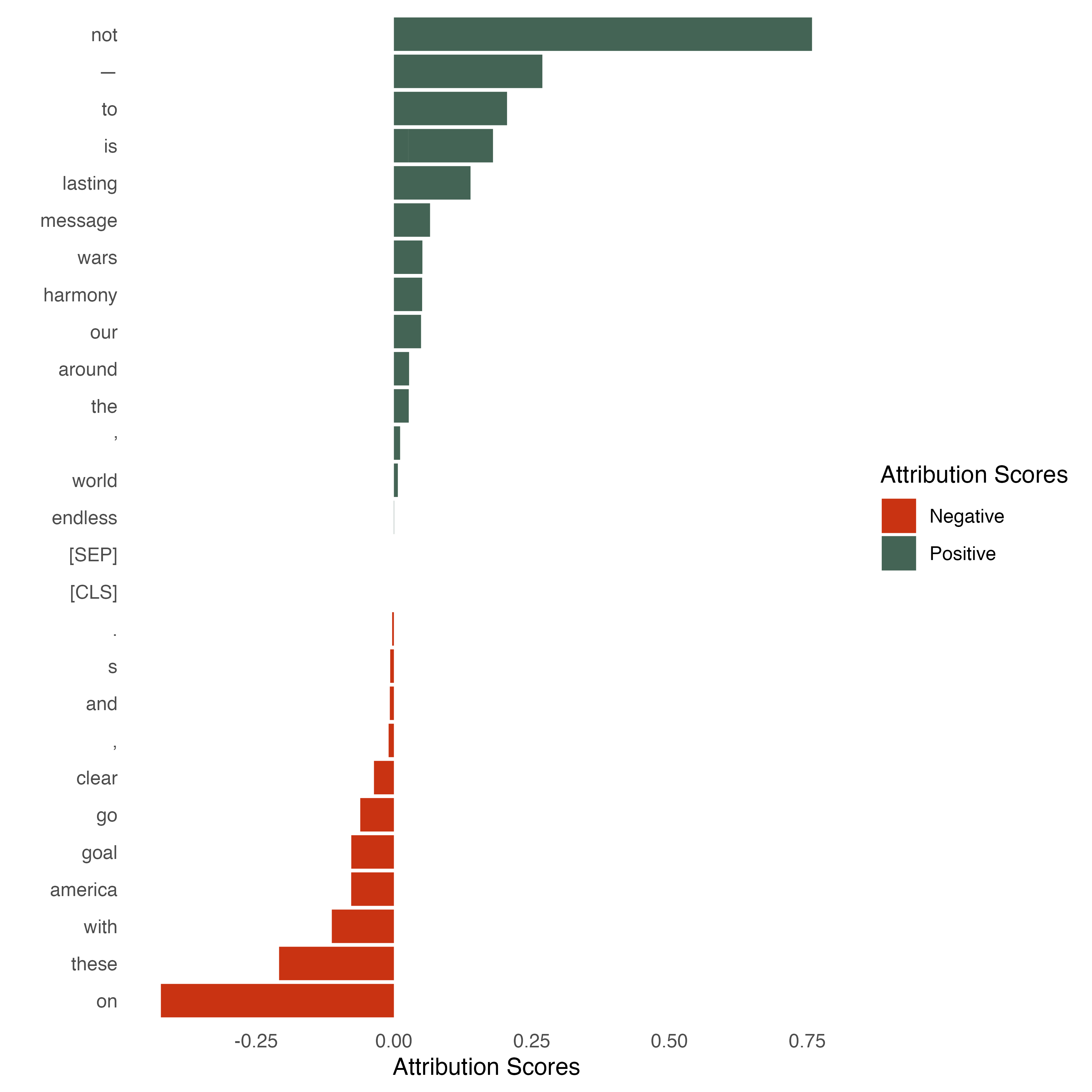
('[SEP]', 0.0)]We can also use the output to generate another visualization that gives us an easily accessible overview of the attribution scores. We again use the same color codes as in the previous visualizations. Red means again that the tokens contribute negatively to the classification while the token in green contributes positively. Those in the middle ([SEP] and [CLS] for instance) are categorized as “neutral” (or no contribution) but don’t have any bars because their value is zero.
Code for creating the visualization
# Install pacman (package manager) if not done already
# install.packages(pacman)

# Load the tidyverse package via the pacman package manager
pacman::p_load(tidyverse,
               reticulate,
               dplyr,
               data.table)

# Get word_attributes from Python and transfer them into the R Environment
word_attributions <- py$word_attributions

# Now we need to do some pre-processing and extract relevant elements from the list
word_attributions_df <- as.data.frame(rbindlist(word_attributions))

# Visualize the attribution scores for each token using a barplot
word_attributions_df %>%
  # We do some housekeeping first
  rename(token = V1, attribution_scores = V2) %>%
  arrange(token, attribution_scores) %>%
  ggplot() +
  # We do a bar plot that has the years on the x-axis and the level of the
  # net-sentiment on the y-axis
  # We also color it so that all the attribution scores greater than 0 get a
  # different color
  geom_col(aes(
    x = reorder(token, attribution_scores, sum),
    y = attribution_scores,
    fill = (attribution_scores > 0)
  )) +
  # Reverse the axes
  coord_flip() +
  # Here we define the colors as well as the labels and title of the legend
  scale_fill_manual(
    name = "Attribution Scores",
    labels = c("Negative", "Positive"),
    values = c("#C93312", "#446455")
  ) +
  # Now we add the axes labels
  xlab("") +
  ylab("Attribution Scores") +
  # And make the theme a bit more beautiful
  theme_minimal() + theme(
      strip.background = element_blank(),
      panel.grid.major = element_blank(),
      panel.grid.minor = element_blank()
  )
Alternative text
The visualization shows word_attributions. Again, we use the same color codes as in the previous visualizations. Red means that the tokens contribute negatively while the token in green contributes positively and white is considered neutral (or no contribution).
This allows us to also have some numerical output next to the visual output. Positive numbers indicate that the feature contributed positively to the classification and negative numbers indicate the opposite. Here we can see from both the numbers and the visualization, that it is mainly the word not that seems to drive the positive classification of the sentence. This is interesting given that a human reader might probably rather go for other words such as harmony or lasting. This can be a first indicator that we need to fine-tune the model. Another interesting pick is the effect of punctuation. The full stop at the end of the sentence seems to negatively contribute to the classification. Here, it would be interesting to see how the model behaves with another punctuation. Understanding how changes in the features can change the model behavior is what explainable AI is for!
Using Transformers Interpret on multiple sentences
Repeating the steps above for all selected sentences shows us what Transformers Interpret can tell us about the remaining sentences. We can also see the variance of positively and negatively labeled attributes.
Code for creating the visualization
# Define a custom function that generates the word_attributions
# and returns the visualization
def interpret_sentence(sentence):
  word_attributions = cls_explainer(sentence)
  return cls_explainer.visualize()

# Here we iterate over the random_sentences and return the
# visualizations for each sentence
for sentence in range(len(random_sentences)):
    interpret_sentence(random_sentences[sentence])
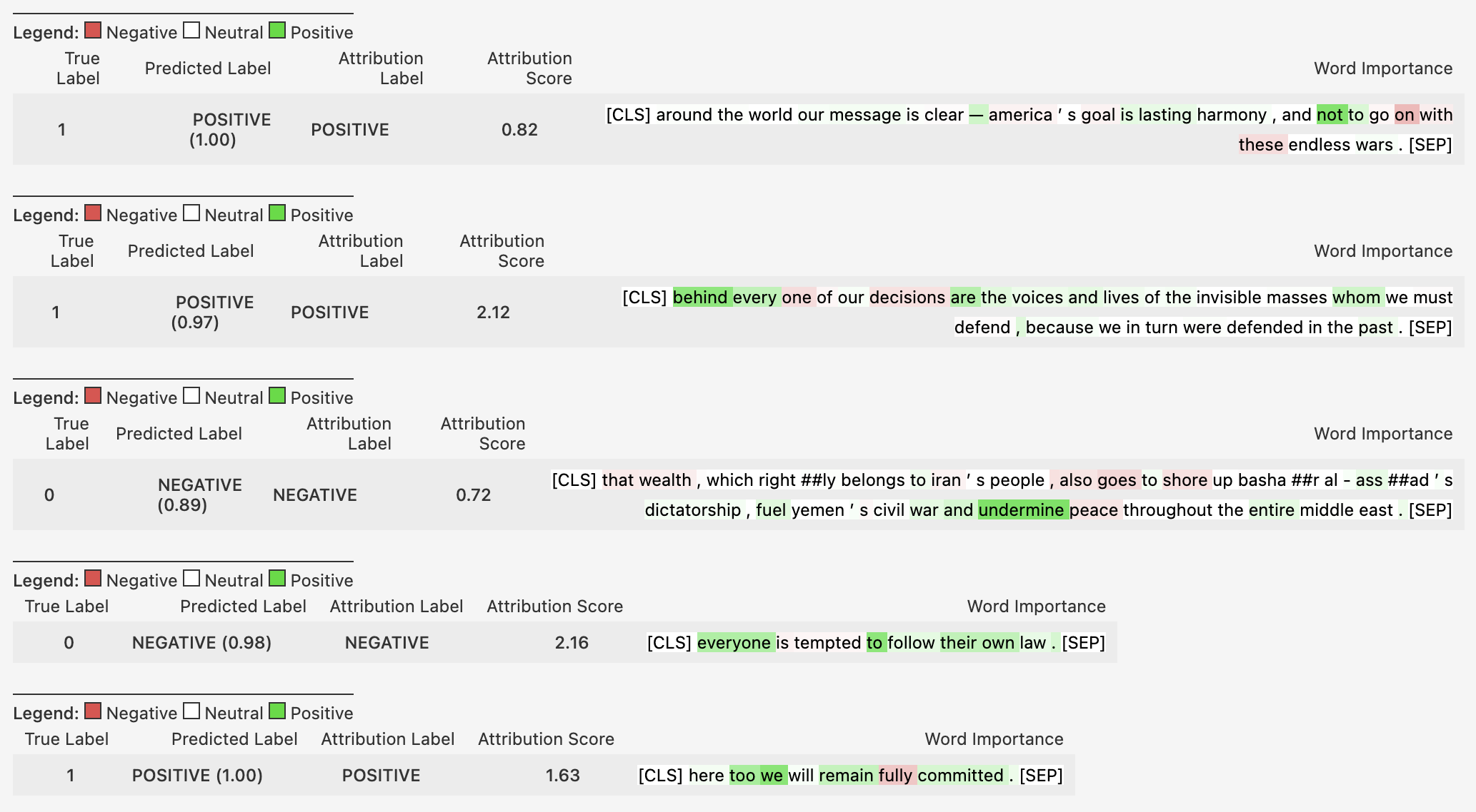
Alternative text
Output for the visualize() method for the following five sentences:
- Around the world our message is clear – America’s goal is lasting harmony, and not to go on with these endless wars.
- Behind every one of our decisions are the voices and lives of the invisible masses whom we must defend, because we in turn were defended in the past.
- That wealth, which rightly belongs to Iran’s people, also goes to shore up Bashar Al-Assad’s dictatorship, fuel Yemen’s civil war and undermine peace throughout the entire Middle East.
- Everyone is tempted to follow their own law.
- Here too we will remain fully committed.
We see that, in particular, sentences 2 and 5 are positively attributed while sentences 3 and 4 are negatively attributed. This visualization shows the predicted label, the attribution label, the overall attribution score, and, most importantly, a visual component on the right-hand side. Red highlighted parts contribute negatively to the classification while green highlighted parts contribute positively and white (so no highlight) are considered neutral (or no contribution).
We see that – based on the overall attribution score – in particular sentences 2 and 5 are labeled as positive, while sentences 3 and 4 are leaning more towards a negative sentiment. Two interesting takeaways here: First, we see that the magnitude of the attribution score varies across sentences and that the attribution score of the first sentence is rather low in comparison to, for instance, sentence 2. Second, when looking closer at sentence 3, we see that peace and wealth (for instance) are highlighted in red. This informs us as to how these words contributed to the prediction. Since the prediction is “negative” it makes sense that the words peace and wealth do not contribute to the prediction but that it is instead a word like undermine that pushes the model to classify the sentence as “negative”.
Potentials and challenges of explainable AI for research and applied use
Using explainable AI for better model understanding and fine-tuning
Looking at a few examples (as we just did) is great. But looking at more is even better! This way, we can develop a good understanding of why the model classifies data the way it does and give us an idea of where to improve the training data. Although we can theoretically compute the attribution scores for each input, going through the output requires manual work. In practice, we will be inclined to limit the checks to a sample. In this case, we risk cherry-picking. To avoid this, we should start thinking of a framework for how to best integrate a consistent and systematic explainable AI check in our model evaluation. Depending on the data size, it might be impossible to check all input but we could strategically focus on specific cases. We could, for instance, check a certain percentage of cases falling into a clear positive or negative classification (based on the probabilities) and then, to a larger share, a percentage of those cases falling into a probability area around the threshold. These cases are likely to be somewhat of an “either/or”-decision where it is a great way to learn from explainable AI why the model opted for either a positive or negative classification. These insights will also help us further fine-tune the models (if needed).
Detecting biases and building fair(er) models
But this is not the only use case of explainable AI. A better model understanding also allows us to detect biases and build fair(er) models. Hovy and Prabhumoye (2021) identify five sources of bias in NLP:
- the data,
- the annotation process,
- the input representations,
- the models, and finally,
- the research design
Source: Hovy and Prabhumoye (2021), p. 1
Using explainable AI can help us to understand how the model behaves and where potential biases may have been injected. One example was revealed by Arvind Narayanan and Aylin Caliskan who showed that Google Translate tended to associate job professions in a gender-biased manner. Using a gender-neutral Turkish pronoun, they showed that professions such as nurse and teacher were associated with women (e.g., “she is a nurse/teacher”) whereas translations of sentences involving professions such as professor or doctor were more likely to be associated with men (e.g., “he is a doctor/professor”). Thus, when training data are biased, the model is likely to reflect gender-specific biases and stereotypes (Caliskan, Bryson, and Narayanan 2017). Using model explainability can therefore not only benefit practitioners but also general audiences by reducing the reinforcement of gender-specific stereotypes.
But explainable AI is also beneficial beyond text-based models. A prominent example that was portrayed in the Netflix documentary “Coded Bias” highlights the discriminating effects of biased training data in facial recognition. The MIT researcher Joy Buolamwini discovered that dark-skinned faces are not detected accurately but that the program only worked when she wore a white mask. Becoming aware of these effects and biases is a crucial step in making the world a fair(er) place for everyone.
Another example – while less about fairness – is a situation that you are likely to experience when using reverse vending machines at the supermarket. Why do these machines fail to detect your water bottles correctly and, more importantly, what can you, as a user, do about it? Envisioning some improvements, explainable AI could help and visually tell which parts of the bottle were accurately detected and which were not. This could then help us to place the bottles in the correct position when inserting them into the reverse vending machine.
Using explainable AI as a standard for rigorous model checks
As a last potential for explainable AI, we want to draw attention to technical reporting. When we turn to academic papers, we typically report common model metrics such as precision, recall, or F1 scores14 to show how well our models perform. Digging deeper and doing a more qualitative evaluation of what the models do is needed. With the methods provided (and based on) frameworks such as Captum, this is luckily not too difficult to implement. It helps us to better understand what the models do and why they do it. In scientific papers, we could use this approach, for instance, as part of rigorous model checks, and, if the models are deployed somewhere, having an explainable AI dashboard would be a great asset to monitor and evaluate the model performance beyond the typical model metrics.
Further reading
- Achterhold, Eva @ SSDL (2022): Investigating Fairness in Data-Driven Allocation of Public Resources
- Abdullayev, Turgut (2020): State-of-the-Art NLP Models From R
- Biecek, Przemyslaw and Burzykowski, Tomasz (2020): Explanatory Model Analysis
- Bach, Ruben and Küpfer, Andreas @ SSDL (2023): Getting started with Python (Part I)
- Bach, Ruben and Küpfer, Andreas @ SSDL (2023): Getting started with Python (Part II)
- Captum: Comparison of Algorithms
- exBERT
- Google Colab Notebook With the Code
- Huggingface: Tasks
- Huggingface: Tutorial
- Meyer, Cosima and Cornelius Puschmann (2019): Advancing Text Mining with R and quanteda
- Meyer, Cosima: Data Illustrations
- Molnar, Christoph (2022): Interpretable Machine Learning - A Guide for Making Black Box Models Explainable
- Shapiro, Tanya @ R-Ladies Cologne, PyLadies Munich, R-Ladies Paris, PyLadies Tunis (2022): Bringing Your Plots to Cloud Nine With {Plotnine}
- TensorFlow: Integrated Gradients
- Transformers Interpret
References
If you are looking for a concise overview of how BERT models are positioned within other large language models, H2O has something for you.↩︎
Larger datasets are necessary to not only learn more sophisticated data patterns but also split the data into separate train, validation, and test sets, as is typically done in machine learning. Data splitting provides a more comprehensive approach for tuning the model, validating model performance and serving as a robustness test. This is crucial to ensure the accuracy and reliability of the analysis results. Traditional analyses in social science often rely on the entire data set, i.e. do not split between train (validation) and test data. This is a plausible approach when facing limited data but may be worth rethinking when having the benefits of larger data sets. The split, which is common in machine learning, allows the researcher then to specifically validate the performance of the model and can thereby serve as a robustness test.↩︎
The opposite of unsupervised learning is supervised learning. Here we provide the model with labeled data (for instance multiple sentences that are labeled as being “positive” or “negative”). For pre-training a BERT model, raw data are sufficient. In this step, the model acquires an understanding of the language and learns, for instance, which words often go together in specific contexts.↩︎
As a side note: the famous paper “Attention Is All You Need” that introduced the novel architecture of transformer models uses the word “attention” as a pun in its name (Vaswani et al. 2017).↩︎
Depending on your pip version, you might need to call
piporpip3to install the dependencies.↩︎This is achieved by only using six encoder blocks instead of twelve. Additionally, some internal processing (for instance token-type embeddings) are not included in distilBERT.↩︎
Besides Transformers Interpret, there is another library called exBERT. With exBERT, you get an interactive application that allows you to better understand the contextual representation and what the model has learned when it comes to representation.#↩︎
Besides PyTorch, there are more machine learning frameworks in Python. Another alternative is TensorFlow with its high-level keras API which was developed by Google. If you are an R user, you may have come across tensorflow, keras {torch} which allow you to use these tools in R.↩︎
Taking a step further and looking into the documentation of Captum, we see that we can go beyond the attributions and try to interpret BERT’s layers.↩︎
A note of caution here: these algorithms are no panacea and there is also a risk of manipulation as research shows (Wang et al. 2020).↩︎
For those less familiar with Mannheim: the building that you see is Mannheim’s water tower (or “Wasserturm”), one of its landmarks surrounded by a beautiful small park.↩︎
Since for text data linear interpolation can be quite complex to capture, there are also discretized integrated gradients that take non-linear interpolation into account. So instead of drawing a linear line between the steps, it draws a non-linear line and introduces variations of words (for instance, “bad”, “good”, and “perfect”) to understand what the model predicts. The concept is nicely described in the paper by Sanyal and Ren (2021).↩︎
The TensorFlow blog post nicely describes this method using images where it’s like adding more saturation to the image, for instance.↩︎
A detailed explanation of how precision, recall, and F1 score can be calculated and why they are useful can be found here.↩︎